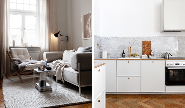
The purposely sloppy paint in this shot has such a nice graphic effect in the otherwise very simple living room shoot styled by Pella Hedeby for Ikea.
Sloppy paint as a statement
This entry was posted in Interior Inspiration. Bookmark the permalink.


