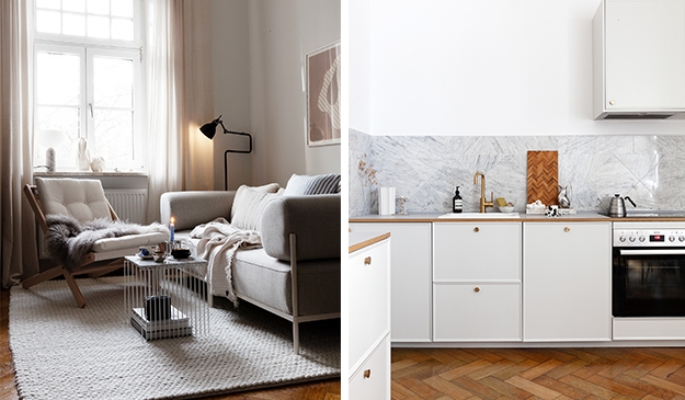
I love the contrast in this interior styling with the modern design elements in the antique and historic building. I think this is such a great mix of textures and materials, both old and new. I love the simple white lines of the Menu Afteroom chair and the Asplund Kub against the marble, concrete and other stones.
I don’t like to use so much color in my own interior. This is a good example of working with textures and materials to make an interior interesting, rather than with colors. A great inspiration for making an interior styling at home as well (minus the historic pillars of course).

What I recognise above: HAY Lens box – HAY clip coffee spoon – HAY Lup candle holder – Frama diamond bulb

Photography by Elok Holsegård, styling by Sofie Brünner via Yellows for the Nordic Courier


