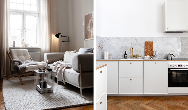
The turn of the century details in this light filled apartment are absolutely stunning. The details on the wall and ceilings are very present and perfectly enhanced by keeping the furnishings relatively minimal.
The black furniture throughout adds a nice contrast to the beige and white walls and the kitchen was perfectly fitted within the original mouldings and details that were there. I like this combination of modern and old.
via Ahre
[do_widget id=image-21]


