This mostly white Swedish home is far from boring if you ask me. I think the gallery wall in the living room works very nicely and adds a personal touch to this otherwise calm and modestly decorated space. I love the mixture of vintage and modern art prints combined and the gallery becomes even more impressive because it reaches from the sofa onto the ceiling.
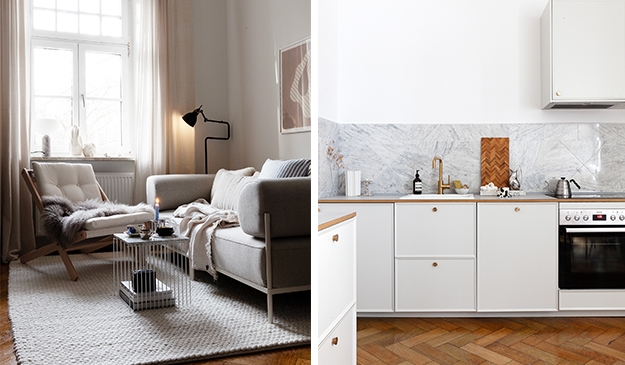
The kitchen is all white as well, with a white marble countertop and glossy white tiles. It’s a classic white shaker kitchen that fits the space very nicely and I love the peninsula kitchen island in between the two turn-of-the-century windows.
The bedroom would be the only room in this place that has a darker color on the wall, making it a bit more cozy and moody. The grey walls work very nicely with the dark wood bentwood chair and the mixture of muted colors on the bed.
via Stadshem


