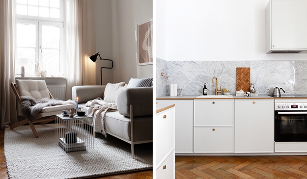
AD – As you might know, I moved into my current apartment in Munich at the end of last year and have since been busy decorating the place. I like to take my time for this and rather wait a little to make better decisions. In Germany, rental apartments often don’t come with a built-in kitchen, but luckily, the previous renter had built in an Ikea kitchen which is working and has been used for the past months (see below). While functional, I didn’t really like the look of it. It has these white glossy cabinet fronts and a fake walnut countertop that is damaged. The tiles on the wall are Carrara marble, but since there are so many different lines and textures in the materials, they don’t get the chance to shine.
Since the structure of the kitchen is still in good condition, I thought it was the perfect opportunity to work together with Danish design firm Reform to give this Ikea kitchen an update, while still using most of the existing kitchen cabinets. Reform recently opened a showroom in Munich, which I visited multiple times to plan the kitchen with the wonderful design team there. My first visit was all about picking the design. I had seen many examples of the Reform kitchens on their inspiration page, but seeing the kitchens in real life really helped me to decide on what would look good in my apartment.
Many of the Reform designs are on display in the Munich showroom and they have samples for all the different color and material variants you can use for planning. Even though I wanted to use as much of the old kitchen as possible, I wanted to remove the upper cabinets above the sink to make the room look lighter and bigger (and to not bump my head while washing dishes). The exhaust that is currently there just makes noise and nothing else, so it will be removed and changed into one that can be built in for a cleaner look.
As for the design, I decided to go with ‘Frame’ designed by Note design studio. I think the design is simple, yet intriguing and I love the subtle lines on each side of the cabinet fronts. I wanted a light look in the kitchen that would contrast with the old hardwood flooring so I picked the white Frame version, which shows the wood grains in a very subtle way. Since the upper cabinets will be removed for a lighter look, I decided to add a separate lower module on the other wall to add storage space and more counter space. This module is finished already, you can see it in the first picture and I just absolutely love the look. I went for brass handles and a Fenix worktop with an oak wood border in the front that matches the color of the hardwood flooring.
I will show you the entire kitchen soon, we only started with the removal of the main part of the kitchen and in an old building, where everything is crooked, it all takes a little while to get everything done. I’m so happy with the first area of the kitchen though and it gives a nice sneak peek into how everything will look like once it’s finished. Stay tuned!


Above you can see pictures of my kitchen in its current state, below the pictures I took in the Reform showroom in Munich.


