I love how the catalog images from H&M Home are always so on point and this isn’t any different for their pre-fall collection, which has beautiful soft beige tones. In the collection itself, it’s the organic objects* that stand out the most to me.
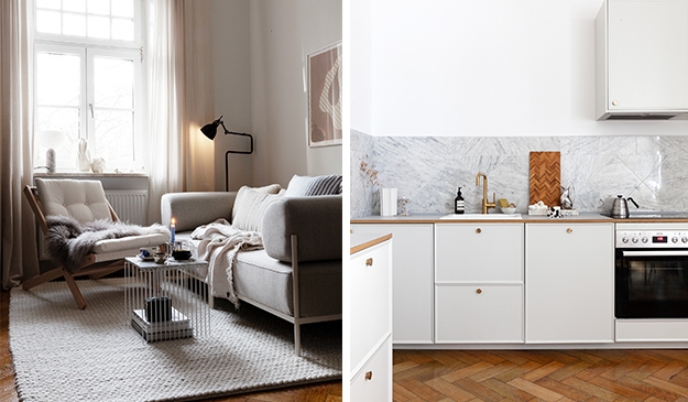
I love the living room setup especially, which has lots of beige tones in the furniture and the architectural details, which forms the perfect setting for the carefully selected textiles and objects. How cool is this built in vitrine against the wall ? This just makes every single object special in my opinion.
The bathroom and bedroom are decorated in such a nice way as well, with light and natural objects for a look that works serene and calming.
Styled by Sundling Kicken, art direction by Therese Sennerholt, photographed by Erik Lefvander
[do_widget id=media_image-11]
[do_widget id=media_image-11]


