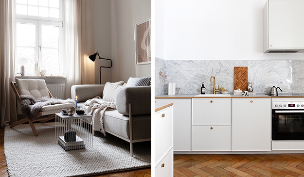
While I was designing my kitchen in both my studio home in Antwerp and my apartment in Munich, I was checking the inspirations on the Reform website constantly, but once I figured out the perfect configuration with the Reform team and my kitchen has been finished for a while, I realized I haven’t been checking their beautiful inspirations for a while.
I love browsing through the wonderful inspirations with Reform kitchens on their website and here are my current favorites.


The owners of this historic Nyhavn apartment from 1845 in Copenhagen chose the BASIS design in red linoleum combined with a Calacatta viola marble countertop. This color combination brought a sense of vitality and texture that contrasted the already textural, slightly wonky architecture. The painted fronts matched with the rest of the apartment, integrating the space easily, while the red island gives a pop of color that ensures the space stands out.


The FRAME design in dark oak causes a wow effect in this family home in Copenhagen. This family knew that they wanted their kitchen to be the heart of the home. The kitchen and living room act as a large, open-plan room, and the owners say that this is where they spend the most time. As a result, getting not only the aesthetic but also the functionality right was essential. While storage was not the most important aspect of the dark wood kitchen design, the owners say that due to the kitchen island, they ended up with more than they ever thought possible. The fact that this is ‘hidden storage,’ as opposed to having high cabinets throughout the room, is exactly what the owners wanted.


Danish jewelry designer Sophie Bille Brahe chose the PLATE collection by Studio David Thulstrup for the kitchen in the new showroom in the heart of Copenhagen.


The BASIS kitchen in this beautiful open-plan Stockholm apartment is aesthetically integrated with the rest of the home. The kitchen was designed to look like it was meant to be part of the existing space. A custom beige paint was used on both the fronts and the handles, for a pleasing monotone that contrasts with the light gray marble countertops and gleaming white subway tile backsplash.


