Even though the walls of this beautiful Swedish apartment have been painted white exclusively, the black kitchen cabinets and the colorful furniture pieces and accessories add a lot f character and personality to this interior.
The black kitchen cabinets can be seen from the open doorway of the living room and they add so much contrast to an otherwise light interior, which has been enhanced by subtle pops of color and a bold combination of patterns in the living room.

Black kitchen cabinets and a subtle pop of color
The black kitchen adds a lot of contrast to this kitchen interior with white walls and white-soaped hardwood flooring. The black kitchen cabinets are spread on both the top and bottom of the L-shaped layout, leaving the space by the window available for a beautiful round dining table.
The off-white stone countertops complement the black cabinets and the white walls nicely and the black hardware is so subtle it’s barely noticeable on the black kitchen cabinets.


The round dining table with the oak dining chairs is neutral in color, yet by adding a bright orange pendant light above the table and a small colorful gallery wall on the white walls, this dining room area becomes so interesting.

The black kitchen cabinets can be seen from the living room, and add contrast to the entire interior.

An eclectic mix of colors and patterns in the living room
While the rest of the apartment has been decorated in a rather subtle way, the living room has a bolder look. The area rug and lounge chair resonate a seventies vibe, mixed in with modern and mid-century modern elements for an interesting combination.
The TV has been integrated into a gallery wall, which makes it stand out less and the plant in the corner finishes the look off with a lovely touch of greenery.


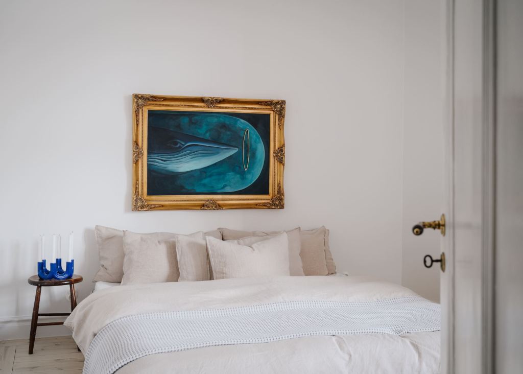
A minimal white bedroom with an eye-catching artwork
While the design of the bedroom is cozy yet minimal, the artwork inside the ornate gold frame adds a true eye-catcher to the space. The light beige bed linen and the subtle bed frame blend into the minimal space, while the blue of the artwork comes back in the blue candle holder on the bedside table.


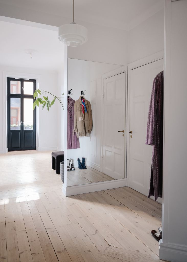
A large mirror to make the hallway appear bigger
A small wall in between the front door and the living room creates a small hallway area, however, by covering this wall section with. a full-size mirror, it reflects the hallway and makes it appear bigger.


Photographed by Ozolappa, styled by Yngfalk for Historiska Hem


