If you’re planning a kitchen remodel, there’s nothing quite as timeless as white shaker cabinets. This style and color are extremely versatile and offer an easy way to give your cooking space a classy refresh.
Although white shaker kitchen cabinets might seem boring at the outset, you can use them as inspiration to give your kitchen a gorgeous aesthetic. Read on for a list of the most inspiring white shaker kitchen ideas that will help you give this space a fresh new look you’ll enjoy for years to come.
Use Gold Hardware to Add Warmth
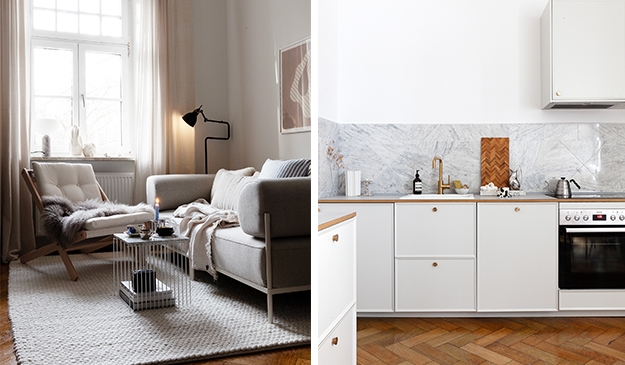
Although the homeowner chose classic white cabinets for their kitchen remodel, they also added subtle touches of gold to create a sense of warmth. A solid marble backsplash and coordinating marble countertops tie the shaker cabinets together with everything nicely.
Although this kitchen is simple and understated, the accents of gold give it a slightly modern touch. Note how the walls and ceilings are painted white to ensure that everything is cohesive for a nice flow.

via Alvhem
Gray Countertops Create Contrast
The gray marble countertops in this kitchen give it a warm, inviting touch. The use of gray also contrasts beautifully against the more traditional shaker cabinets featured in classic white.
Large drawers and roomy base cabinets provide plenty of storage for items like pots and pans. A smoked glass globe and brass light fixture brings this traditional kitchen a splash of modern style along with the oversized stainless steel range hood.

via Alvhem
Combine Different Cabinet Styles
The cabinetry in this kitchen features various styles, contributing to its stylish aesthetic and overall functionality. Tall upper cabinets with clear glass doors provide a place for display and keep everyday items easily in view.
Floor-to-ceiling cabinets to one side provide a pantry for storing dry goods and baking essentials. The dark wood herringbone floors anchor the room, and this design proves you can enjoy shaker cabinets installed in any size space.

via Nordiska Kök
Use Neutral Tones for Small Spaces
Even if your kitchen is small, incorporating light, neutral colors will help it to feel larger. The skylight in this space also allows natural light to come into the room, creating a bright and airy feel.
Although the design here has classic white cabinets, the overall feel of the room is modern and clean. Since this home has an open floor plan, the designer opted for light wood floors and coordinating colors on the furniture, area rug, and accessories to keep everything harmonious.

via Alvhem
Incorporate Modern Features
This kitchen is chock-full of modern features like convenient under-cabinet lighting and sleek fixtures. Large black metal hardware on the lower shaker-style cabinets gives them a bold, dramatic touch.
Notice how the singular open upper cabinet features a darker color, creating visual contrast and an artistic-inspired element. Dental crown molding below the kitchen ceiling adds lots of fun detail to this kitchen and is a perfect example of incorporating a mixture of old and new elements to create your dream kitchen.

via Sjöman Frisk
White Shaker Cabinets Keep Things Minimalist
An open wall space with a single shelf helps keep this kitchen open rather than feeling cluttered or too busy. The classic white color of the cabinet doors works well with the matching wall color, and a smattering of houseplants adds a nice organic element.
Selling white shaker cabinets to some homeowners can be difficult, but it’s a very easy way to make any kitchen look fresh and brand-new again. Here, the simple, clean lines and minimal use of color and accessories make the entire kitchen appear light and bright.

via Nordiska Kök
Try Off-White Instead
Rather than using stark white, these shaker kitchen cabinets have a slightly off-white, almost tan hue. The wall color is slightly lighter, but it’s not completely white, which gives the space a subtle two-toned look.
A white farmhouse sink adds country charm, and two small wall shelves between the upper cabinets and the support beam give the homeowner a place for storage or display. To the left, a large window allows natural sunlight to pour into the kitchen, creating an airy feel.

Photographed by Ozolappa, styled by Lingsell for Historiska Hem
Add Fun Pops of Color
This kitchen boasts off-white shaker kitchen cabinets, lots of windows, and a white corrugated metal ceiling that adds a charming touch. Notice how the designer added a few colorful accents to make this space feel more cheery and up-to-date.
Instead of a traditional separate dining room, this kitchen features a comfy window bench with cushions and a dining table for tons of versatility. Different styles of light fixtures also help to contribute to the sense of whimsy in this cheerful space.

Photographed by Mia Borgelin for Historiska Hem
Use White to Design an Elegant Kitchen
White isn’t just classic, it’s also an elegant color that pairs beautifully with touches of metallic, like the faucet and hardware here. The marble countertops look stunning atop the traditional white cabinetry.
A flowy white sheer curtain over the window brings a soft, wispy vibe to the space. A crystal chandelier delicately hangs overhead and ties the luxe, elegant theme together.

(Styled by @vasakvadrat, sold via Sjöman Frisk
Mix and Match Textures for an Eclectic Kitchen Design
The white shaker cabinets are just one part of the overall design in this kitchen, but a myriad of other materials gives it a more eclectic look. Herringbone wood floors in a deep brown finish add warmth, and detailed ceiling molding brings the space an elegant vibe.
A white herringbone tile backsplash extends across both sides and looks beautiful against the light gray walls. The glass globe wall sconce matches perfectly with other touches of silver including on the cabinet hardware and faucet.

via Entrance Makleri
Design Custom Cabinets to Maximize Storage
You don’t have to use RTA cabinets to enjoy a beautiful, functional kitchen. Custom cabinetry provides flexibility and more room to store everything you need in one area.
These off-white shaker cabinets are built into each side of the kitchen along with some additional open shelving for convenience. Even with a large open area on the wall above the stove, there’s plenty of storage here thanks to the custom cabinet design.
The butcher block countertop adds a warm element to the white shaker kitchen.

via Alvhem
Install Cabinets on Just One Wall
This open kitchen features white shaker kitchen cabinets on just one wall, but there’s still ample room to store everything you need. A pair of glass doors adds an airy look to this kitchen, and the light green wall gives it a touch of whimsy.
Using cabinets that extend to the ceiling helps you maximize storage space. Draw out the process of your cabinet installation in advance to make it easier when you mount them on the wall. This is also a smart way to ensure the full layout is constructed exactly how you want it to be before work begins.

Styled by Linnéa H. Manaberi, photographed by Frederik J Karlsson for Alvhem
Focus on Creating a Cohesive Space
From the marbled countertops to the white subway tile backsplash and wide crown molding to the matching white wood floors, this kitchen is stunning in every way. Everything flows nicely, making the space look cohesive and thoughtfully put together.
If you’re not sure which shade of white to choose, get a paint sample or two before you start remodeling. Matching material colors as closely as possible is what gives the space that gorgeous, seamless visual flow.

via Stadshem
Add as Many Cabinets as Possible
If you love to cook or have a big household, add as many white shaker cabinets as possible. This kitchen features a large built-in section of cabinetry that goes around the refrigerator for more storage.
There are upper and lower cabinets here which also contribute to the space’s functionality. The dark wood floor helps to visually break up the space so the white isn’t too overwhelming.

via Bjurfors
Dress up Cabinet Doors of White Shaker Kitchen Cabinets
Bold hardware can make a shaker cabinet door look stunning, even if everything else is traditional. Brilliant metallic hardware in colors like brass, gold, or polished nickel makes any kitchen pop.
Note how the homeowner chose to install matching finishes on the fixtures, including the oven handle. This helps to make every detail stand out while maintaining a classic aesthetic.

Incorporate Earthy Elements
This kitchen has white shaker cabinets, but it also incorporates some natural elements into the design. Materials like wood can add a warm and inviting feel to your cooking space.
The hardwood floors and butcher block countertops give this kitchen a casual, bohemian vibe. The rattan furniture and a lively houseplant complete the look.

Photographed by Mia Borgelin for Historiska Hem
Less is More
An elegant kitchen shouldn’t be overdone or cluttered. In this kitchen, the wall remains blank except for one lone floating kitchen shelf.
Although it has detailed trim and sleek hardware, it still exudes a soft, elegant appearance. High-quality solid surface countertops and beautifully done herringbone floors take this classic kitchen to the next level.

via Nordiska Kök


