This beautiful modernized attic apartment (Styled by Yngfalk interior, photographed by Mia Borgerlin for Historiska Hem) features gorgeous curves in the ceilings where the windows are and a modern natural oak kitchen with limestone countertops and a matching backsplash.
The living kitchen includes a dining table in between the kitchen space and the sofa area. The guest bedroom that lies right next to the sofa area is separated from the rest of the space by a glass and metal partition that is custom-made to fit the sloped ceilings of the attic home.
The main bedroom has a dark grey wall color for a moody effect that is paired with a comfortable grey bed and custom oak cabinets built inside the walls. The bedroom has an impressive walk-in closet that uses the same oak wood as the rest of the apartment.
Both the bathrooms in the apartment feature limestone finishes, which add a beautiful natural effect to the modern bathroom designs.
A spacious living kitchen featuring natural oak kitchen cabinets
The natural oak kitchen cabinets paired with the limestone kitchen countertop and backsplash provide a natural touch to the crisp white walls and natural hardwood flooring in the apartment.
The attic kitchen layout is built mostly on the back wall of the space, with two high cupboards added on the wall opposite the window for extra storage.
The oak kitchen is paired with a red stone dining table and white fabric chairs that fill the area underneath the curved window perfectly. The pairing of the red stone on the table and the beige stone in the kitchen adds an interesting look to the space.
The copper Kitchen Aid on the kitchen counter brings back a little bit of a red undertone that complements the dining table nicely.
While the bottom cabinets and high cupboards are made of natural oak, the upper cabinets have a beige laminate treatment to ensure the layout of the kitchen remains light and airy, which is so important in a space with sloped ceilings.
The black faucet stands out against the beautiful backdrop of the beige limestone and adds a bit of contrast to the setting.
A striped sofa and built-in bookshelves in the living section
The combination of the striped sofa with the pattern on the white and beige rug adds a playful effect to the living space, which is balanced out by the glass Gubi Pedrera coffee table with a minimal appearance.
On the wall underneath the window, you can find custom built-in bookshelves that make use of the lowest area of the sloped ceiling. Since the bookshelves share the same oak wood as the kitchen, they tie the look of the living kitchen together nicely.
Opposite the sofa, you can find a fireplace and a TV wall right next to each other. The wall is treated with limewash paint, which gives it a beautiful texture and effect.
Right next to the living room, you can find a small guest room, which is separated from the rest of the space by the use of a glass partition wall.
The custom glass partition has a metal frame around it, which accentuates the fit within the sloped ceiling of the space.
The guest bedroom also features built-in cabinets for storage, making use of the low ceiling height just like in the living room.
A dark grey wall color for a moody effect in the bedroom
Inside the wall below the window, you can find oak wood storage drawers just like in the other rooms of the apartment.
The main bedroom features a walk-in closet that leads towards the main bathroom of the apartment.
The oak wood used in the custom closet modules is the same one used for the kitchen and the custom storage elements inside the walls.
Limestone wall and floor tiles in the main bathroom of the apartment
The beige limestone material used in the kitchen also comes back in the wall and floor tiles of the main bathroom, which features a minimal white bathtub underneath the skylight. The modern black fixtures add a beautiful contrast to this bathroom setting.
The walnut wood vanity fits perfectly inside a niche spot in the wall, with mirror-covered wall storage above the sinks.
A dusty pink kid’s room
The small kid’s bedroom is painted in a subtle dusty pink wall color that adds an elegant and warm effect to the space.
An entryway where two different floors collide
The entryway area features grey floor tiles in a small section when you come in, which go over into warm hardwood floors when you continue your way into the rest of the apartment.
A guest bathroom with beige walls and walnut and limestone details
The walls of the guest bathroom are painted in a soft beige wall color, which pairs wonderfully with the beige limestone tiles on the floor and the walnut details on the vanity.
The walnut vanity is paired with a black mirror and black fixtures for a modern effect.
In the area underneath the sloped roof, you can find a washing machine smartly built inside of a cabinet that is painted in the same color as the walls.
Last month I traveled to Denmark to visit the Carl Hansen & Søn factory in Gelsted, Denmark. Throughout the years, the brand has had a strong focus on preserving Danish design classics to gather the best, most iconic modern furniture designs under one roof.
What makes their iconic furniture pieces truly unique is the craftsmanship with which they are created. Each piece of furniture requires hours of handcraft before it leaves the factory.
The factory is one of the most modern furniture production facilities in Northern Europe, with a focus on craftsmanship and sustainability. It has 550 employees and the level of skills that go into the production of the furniture pieces is something I was so impressed by.
During my visit, I was able to take a closer look at the production process of the CH24 Wishbone chair, a true Danish Design icon made by Hans J. Wegner in 1950 and still today one of the most recognizable chair designs out there.
The Apprentice workshop: forming the Future of Craftsmanship
Since quality craftsmanship is the foundation of Carl Hansen & Søn, training more cabinet makers and craftsmen is of the utmost importance to the brand. With the brand’s apprentice workshop, they can meet growing demands and preserve the craftsmanship in Denmark.
The apprenticeship training takes almost 4 years, combining periods in the apprentice workshop, at technical college, and in production. Their first project is a toolbox for their woodworking tools, which is made with a handsaw and traditional supplies. They learn to make different kinds of joints, such as finger and dovetail joints, sanding methods, cut-outs, weaving, and many more machine and hand skills.
The apprentices also learn how to make fixtures for internal use, and how to restore vintage furniture and create commissioned pieces. The combination of these tasks provides them with a versatile skill set.
The apprentices are trained to work with projects that they have to manage from start to finish. They thereby gain an in-depth understanding of the possibilities and challenges of the cabinetmaking trade.
FSC-certified wood: the most important Source Material
Almost the entire collection of Danish design classics is manufactured in the Gelsted factory, except the outdoor collection, which is produced in the Carl Hansen & Søn factory in Vietnam.
The sawmills that provide the source material for the factory have long-lasting relationships with the brand and some supply the factory with the best quality wood since the 1950s. Only the best quality from the inner parts of the trunks are used and all the wood is FSC-certified.
The brand calculates how much wood will be needed for the next year and sawmills from different locations supply the raw materials. Oak wood is typically sourced within the EU, Beechwood within Denmark, and walnut from the US.
The production process of the Wishbone chair
I have talked about the CH24 Wishbone chair designed by Hans J. Wegner and its place inside many modern and classic interiors before and it was such a treat to be able to take a peek behind the scenes and see how they craft their iconic design pieces.
The CH24 wishbone chair has the iconic Y-shaped back and a woven paper cord seat, which has become a famous design icon that has been in continuous production ever since it was brought onto the market in 1950.
The paper cord seat alone takes a skilled craftsman 1 hour to complete and that’s only the last step in the production process to create this truly iconic piece.
Production and sanding of the pieces
The iconic form of the chair involves the production of 14 different parts, including a steam-bent top and the paper cord seat. Each of the parts is sanded during the manufacturing process and inspected thoroughly by skilled craftsmen.
We were able to try out sanding the authentic wishbone chair parts and it is so much more difficult than it looks.
Assembly of the Wishbone Chair or Y-chair
After sanding down the pieces, they are assembled the traditional way using only glue and no screws. Some of the chairs from the Carl Hansen & Søn collection take 20 minutes to assemble, and some take 5 hours, depending on the complexity.
The skilled craftsman uses a variety of different tools to assemble the Wishbone chair and at the end, the CH24 chair is placed underneath blue light to check for any glue residue, as this will show as a dark spot after oiling.
Each chair is stamped with an employee number so that on the rare occasion a chair comes back to the factory with a mistake, the same employee can fix the piece and learn from their mistake.
Applying the paper cord seat
The last step of the production of the Wishbone chairs, after oiling or painting, is the weaving of the iconic natural paper cord seat. 150m of paper cord goes into the seat of one chair and it takes about 1 hour to weave the Wishbone chair, while other more complex pieces like the Faaborg Chair might take up to 1,5 days to complete.
To avoid having to pull through 150m of chord every time, each of the paper chord pieces is 7m long and a knot is tied that can be hidden and will never loosen.
Carl Hansen & Søns commitment to sustainability
Apart from sourcing wood from responsibly managed forests and the fact that their iconic pieces are made to last a lifetime, the factory reuses wastewater in the factory and makes sure every bit of wood is reused in some way.
Smaller wood pieces left after manufacturing the furniture pieces are made into an accessory line specially designed for this purpose, but even the smallest wood shavings don’t get discarded.
The brand repurposes the little scrap that remains as fuel in a district heating plant that provides warmth to more than 400 local homes in Gelsted.
Ad – I was invited on a press trip by Carl Hansen & Søn
Posted inDesign|Comments Off on The CH24 Wishbone chair production: A Peek Inside the Carl Hansen & Søn Factory
This stylish Swedish home (Styled by Studio Rydman, photographed by Lina Östling for Historiska Hem) has white walls and a beautiful, natural color palette with a combination of carefully considered design classics and contemporary pieces in the living room with herringbone hardwood flooring.
The small white bedroom has white-painted hardwood flooring, making this tiny space feel bigger than it is. The bedroom wall has a vintage window looking out onto the kitchen, which provides the space with a characterful look and at the same time guides some daylight from the bedroom into the kitchen, which doesn’t have any direct natural daylight coming in.
The kitchen space lies right next to the bedroom and has a black and white tile floor. The colors of the tiles come back in the white cabinets and the black countertops for an impressive contrasting effect in the small kitchen space.
An elegant living room with white walls and a mixture of classic and modern pieces
The white walls in the living room are paired with natural linen curtains in front of the windows, which warm up the daylight coming into the space. The white teddy couch pairs nicely with the white structured area rug, the white armchair with wood details, and the impressive art print adding contrast to the wall above the sofa.
The Gubi Timberline floor lamp* adds an elegant shape to the setting with its curved arm and folded lampshade, while the organic dark wood coffee table finishes the look of this area off in a perfect way.
The impressive green plant in the corner of the living room sits on a gorgeous little stool and finishes off the gallery wall in this section perfectly. The wall rug on this wall adds so much texture to the beautiful natural color palette.
The tall wall mirror between the two windows adds extra dimension to the space,
A small bedroom with white walls, white floors, and a window toward the kitchen
The small bedroom with white walls and white flooring reflects the daylight coming through the window gorgeously. The green fiddle fig tree next to the bed adds a fresh touch to the color palette and the window sill is filled with books and decor objects.
The white floors are finished with a sheepskin rug and a cute wooden stool, which stand out against the surrounding white tones in the space.
A vintage indoor window connects the bedroom with the kitchen and allows daylight to flow into the kitchen space, which doesn’t get any direct light.
A beautiful selection of brown and beige tones and a travertine lamp decorate the crisp white bedroom window sill.
A white kitchen with black countertops and a black and white floor
The corner kitchen layout features open cupboards on the top, which solves an otherwise lost cabinet space.
Natural daylight comes in through the window towards the bedroom.
A small hallway with custom storage
The hallway features the same black and white floor tiles as in the kitchen, which is paired with custom shelving that includes hooks and a rail for coats and jackets.
This gorgeous turn-of-the-century apartment for sale in Sweden (Styled by Grey Deco, photographed by Henrik Linden for Alvhem) has a combination of sage green living room walls, with dark green wall color in the bedroom. The fact that both rooms can be seen from each other, makes this effect of the two greens even more impressive.
The living room has a neutral color palette in the decor pieces and furniture, accentuating the beautiful and elegant sage green color on the walls. The sofa area has an off-white textured area rug that visually separates this area from the rest of the space, which includes a small dining area in front of the window.
The light beige kitchen with wood countertops is built in a corner layout to optimize the floor plan of this smaller kitchen space without direct natural light coming in. The bedroom is painted in a dark green wall color, which accentuates the historic white doors of the walk-in closets on each side of the bed.
Sage green living room walls paired with a neutral decor
The oak wood coffee table and the dining chairs in the same tone add a natural element to the space, which complements the wood tone of the hardwood flooring in the apartment in a beautiful way.
The green plants in the space are the only touch of color. They add a fresh touch and pop out against the backdrop of the sage green wall color behind it.
The dark green wall color of the bedroom can be seen from the living room and the two wall colors beautifully complement each other.
A beige kitchen with butcher block countertops
The kitchen is built inside of a space that doesn’t get any direct daylight, so the light beige kitchen cabinets are a great choice to keep the design of the space light. The corner kitchen layout allows for a functionality-packed kitchen design with lots of storage space.
The beige cabinets are finished off with chrome hardware and a beautiful butcher block countertop adds a warm touch to the kitchen design.
The regular upper cabinets turn into a small strip of cabinets on top of the stove, which also includes the stove hood and finishes off the top of the corner layout nicely.
A dark green bedroom with white historic details that stand out
The dark green wall color in the bedroom makes the gorgeous historic details on the doors, windows, and crown molding stand out in such a powerful way. The two walnut bedside tables add a darker tone to the setting, while the mixture of beige and white textiles on the bed lightens up the color palette.
Just like in the living room, the green plant in the window sill complements the green tones in the paint color on the walls.
The other side of the bedroom features a spacious home office spot. The round mirror reflects the light coming from the window, which is framed with a beautiful sheer white curtain.
A feature wallpaper wall in the entryway of the apartment
One of the walls in the entryway which connects the different rooms of the apartment, is covered with an eye-catching wallpaper that makes the white door stand out.
A vintage glass cabinet is painted white on the inside, which makes the items and plants on display pop out of this beautiful setting.
This gorgeous historic home in Sweden (Styled by Ã…sa Copparstad, photographed by Fredric Boukari for Historiska Hem) has grey wainscoting throughout the apartment that matches the grey paint color on the historic window and door frames, setting them apart from the subtle paint color on the walls.
The living room features mustard yellow velvet sofas and a TV gallery wall that adds a unique touch to the space. The dining table on the other side of the space has a mixture of white and black bentwood chairs around it for a contrasting effect that is reflected by the round mirror on the wall.
The black kitchen cabinets in the galley kitchen layout are finished with a beige limestone countertop, chrome hardware, and a beautiful white tile on the backsplash creating a gorgeous texture in the space.
The modest bedroom decor includes a vintage armchair and a vintage desk providing the perfect spot for a home office. The second bedroom has a loft bed underneath which a custom desk is included.
A living room with light grey walls and grey wainscoting
The beautiful grey living room wainscoting has the same color as the original details and frames around the historic windows in the apartment. The light grey wall color on the walls above the wainscoting accentuates the darker color while complementing the palette perfectly.
The two mustard-yellow couches facing each other add a beautiful warm pop of color to the space. The wall on top of one of the two sofas has been turned into a TV gallery wall with orange and yellow tones to match the color palette of the living room.
On the other side of the living room, you can find a dark wood dining table with a combination of white and black bentwood chairs. This dining section works in a contrasting way and the round mirror above the table reflects the daylight coming from the living room window back into the space.
A vintage pedestal with a unique bust decorates the area in between the dining and sofa sections.
Black kitchen cabinets paired with chrome hardware and a white tile backsplash
The impressive galley kitchen layout features black kitchen cabinets on each side of the space. The impressive wall of tall cupboards opposite the sink module provides the kitchen with lots of storage space.
The black kitchen cabinets are finished with a beige limestone countertop, chrome hardware with a leather detail, and a black faucet. The kitchen backsplash features a unique white tile design with a beautiful texture that adds a beautiful design element to the space.
On the wall above the stove, the absence of upper cabinets makes the beautiful tile stand out powerfully.
The stainless steel Moccamaster coffee maker matches with style of the metal hardware and the black details of the filter work nicely with the cabinet color in the kitchen.
Behind the tall cupboards, you can find a balcony door that looks out onto the courtyard of this beautiful historic building. A small round bistro table with two natural bentwood chairs is perfect to create a little kitchen dining spot in this area.
Dark brown tones and black accents in a light grey bedroom
The off-white curtains frame the bedroom window in a lovely way and add a soft textural effect to the space.
The beige wardrobe fronts match the historic details and the color palette of the bedroom design perfectly.
The vintage desk in the bedroom provides a perfect home office spot for the space. The vintage leather desk chair finishes the warm wood look nicely and it looks like a comfortable spot to sit and get some work done.
A second bedroom with a loft bed
In the second bedroom, a loft bed with a custom staircase that includes storage space turns this small floor plan into a multi-functional space that provides a spot for sleeping and working on a relatively small surface.
The area underneath the loft bed is turned into a custom desk with small floating shelves.
Grey wainscoting in the entryway of the apartment
The entryway of this beautiful historic apartment shares the same light grey wall color as in the living room and bedroom, paired with the darker grey wainscoting and a few black accent pieces to add contrast to the space.
This cozy Swedish apartment (Styled by Livin Deco, photographed by Mariette Svensson, for sale via Stadshem) has a subtle tone of light beige on the walls in the living room and bedroom, paired with a mixture of dark and light wood tones and a subtle decor with lots of fabric textures for a cozy and inviting effect.
The classic white kitchen has a white marble countertop and a white subway tile backsplash with black grout. The light kitchen design is paired with a light wood round dining table and an elegant mixture of chairs around the table.
The entryway features a floral wallpaper design, giving the space a unique look and the bathroom features black and white tiles for a contrasting effect.
Light beige living room walls paired with dark wood tones and lots of textures
The mirror next to the sideboard reflects the space in a beautiful way and the wood border around the mirror matches the overall look of the space.
The small round dining table is paired with light oak dining chairs, introducing another wood tone to the setting.
The black sideboard adds a bit of contrast against the light beige wall color and the same combination can be observed on the wall in the hallway.
A classic white kitchen with a subway tile backsplash
The classic white kitchen cabinets fill the entire kitchen wall from top to bottom for an impressive effect in the space. The white marble countertop and the white subway tile backsplash with black grout complement the classic white kitchen cabinets and the chrome hardware adds a modern touch to the setting.
In the corner of the kitchen, you can find tall kitchen cupboards that can be opened from either side. This solution is elegant and practical for this floor plan.
The other side of the kitchen space holds a light oak dining table, paired with a mixture of white and dark bentwood chairs.
A bedroom with light beige walls and a natural headboard
The same cabinet fronts that are used in the kitchen are also used or the bedroom wardrobe. The wall-to-wall and floor-to-ceiling arrangement has an impressive effect on the space.
A floral wallpaper in the entryway
A floral entryway wallpaper adds a unique touch to this space without direct daylight. The white entryway wardrobe stands out against the darker backdrop of the wallpaper design and makes for a contrasting effect in the space.
A bathroom with a mixture of tile designs
The bathroom features a mixture of four different tile designs: A patterned tile on the wall behind the toilet, white structure tiles on the wall in the shower, small square floor tiles, and an accent black tile design on the wall above the bathtub.
A timeless kitchen is the dream of many homeowners, but how do you achieve that perfect balance between classic elegance and current trends? The key lies in selecting the right kitchen cabinet colors.
By opting for timeless cabinet colors, you can create a kitchen that remains stylish and fresh while standing the test of time. In this blog post, we’ll explore the top timeless kitchen cabinet colors and share valuable tips on how to create a beautiful kitchen design that you won’t get tired of any time soon.
Key Takeaways
Bright white, classic grey, natural wood, and navy blue are timeless kitchen cabinet colors.
Consider the existing architecture of your home to select a timeless color and combine modern hardware with traditional elements for balance.
Update cabinets or add visual interest through contrasting colors, shelving, and unique accents to achieve a timeless look.
Timeless Kitchen Cabinet Colors: The Top Picks
There are a few timeless cabinet colors that have proven they are here to stay for many years. These colors effortlessly complement various design styles and maintain their appeal over time. The top timeless kitchen cabinet color options are:
Bright white
Classic grey
Natural wood
Navy blue
We will now delve into the unique characteristics of each of these colors.
Bright White Cabinets
White kitchen cabinets have been a popular choice for decades, and for good reason. They create a clean, airy feel in the kitchen, making the space appear larger and more open. Additionally, upper cabinets in bright white reflect light efficiently and provide a neutral backdrop for other elements in the kitchen, allowing you to play around with colorful accents and accessories.
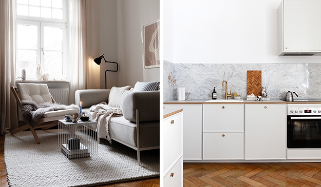
In the example below, crisp white cabinets are paired with metal hardware for a modern effect. Instead of going for white countertops, this small attic kitchen features a grey marble stone on the backsplash and countertop allowing for a mix of classic colors and a timeless effect in the space.
Off-white or cream kitchen cabinets are a great way to achieve a neutral kitchen with an inviting atmosphere and it’s a great alternative to the bright white version.
In the example below, off-white kitchen cabinetry complements the white-soaped hardwood flooring and stands out against the white wall color. The beige limestone countertop and the chrome hardware give this otherwise neutral kitchen a modern and elegant touch.
Classic grey kitchen cabinets offer a versatile and neutral color choice that can work with various design styles and trends. They can create a tranquil and uncluttered impression in the kitchen, making them an excellent option for those seeking a timeless look.
There are several shades of grey to choose from. You can go for light grey cabinets, which will have a subtle effect on the space or you can opt for a warmer greige tone (a.k.a grey-beige) to achieve a timeless and inviting space.
In the example below, the wood finishes in the flooring and dining area are paired with a neutral light grey cabinet color, white countertops, and polished nickel hardware. The black faucet and black wall lamp add a focal point to this otherwise light palette kitchen.
In the example below classic greige shaker cabinets create a warm yet subtle and timeless color palette in a historic space. The color of the greige kitchen cabinets also comes back in the upper cabinets and wall shelving on the wall. The black countertop adds a beautiful contrast to this classic and timeless setting.
Wood cabinets provide a warm and timeless look, making them a popular choice among homeowners. They pair exceptionally well with wood floors and you can go for a natural tone, or opt for a white oak kitchen to achieve a lighter look.
In the example below, white oak kitchen cabinets without hardware add a timeless expression to this modern kitchen with black pendant lights and a beige natural stone countertop.
In the example below, natural oak kitchen cabinets are paired with an expressive limestone countertop and chrome hardware. The warm tones in the wood, stone, and wall color give this timeless kitchen a cozy and inviting look.
Wood kitchen cabinets require regular maintenance and cleaning to preserve their beauty and longevity.
Navy Blue Kitchen Cabinets
Navy blue cabinets add a pop of color while maintaining a classic and timeless feel. They work well with various design styles and trends, from coastal to contemporary, ensuring their lasting appeal.
In the example below, the navy blue kitchen cabinets are mainly located on the bottom half of the kitchen, giving the layout a light appearance. Blue cabinets are much more subtle than black cabinets and the white marble countertops in this corner kitchen layout make the kitchen design blend in with the white walls.
Choosing the perfect timeless cabinet color may seem daunting, but by considering your home’s architecture, balancing trendy and timeless elements, and coordinating with your countertop and backsplash materials, you can create a cohesive and timeless kitchen design.
Consider Your Home’s Architecture
The cabinet color for a timeless kitchen design is heavily influenced by the architectural style of your home. By selecting a cabinet color that complements your home’s architecture, you can achieve a cohesive and timeless look that flows seamlessly throughout the entire space.
For example, bright white cabinets work well with modern farmhouse, midcentury modern, and contemporary home styles, while classic grey kitchen cabinets can augment the features of contemporary home architecture. When in doubt, it’s always good to consult an interior designer and get a professional opinion.
In the example below, cream white shaker kitchen cabinets are built up to the ceiling, which has such an impressive height in this historic space. The oak wood inlay in the glass upper cabinets complements the wood tones in the dining area and the classic herringbone flooring.
You can achieve a timeless, yet visually appealing kitchen by pairing a mix of trendy and timeless elements. Pair a classic cabinet color with modern hardware or accents to achieve a fresh and modern look. The advantage of having your hardware be the trendy element in the space is that you can always swop them out later without having to remodel your entire room.
Consider experimenting with current hardware trends, such as brass, chrome, stainless steel bar pulls, and black hardware, to update your kitchen cabinets while maintaining a timeless look. Additionally, you can introduce trendy accents such as bold colors, and unique textures to add visual interest and create a unique yet timeless kitchen design.
In the example below, simple black knobs and a black countertop add contrast to a light grey wall and light grey kitchen cabinets.
In the example below, brass hardware and a brass faucet stand out of white shaker kitchen cabinets finished off with a white marble countertop and backsplash.
Coordinating your cabinet color with your countertop and backsplash materials is key to achieve a harmonious and timeless kitchen design. By choosing materials that complement each other, you can create a cohesive and visually appealing space.
For example, pair slate or charcoal grey cabinets with natural stone countertops, or coordinate navy blue kitchen cabinets with a white or light grey tile backsplash. Don’t be afraid to mix and match different materials and colors to find the perfect combination that suits your personal taste and style.
Shaker Style Cabinets: A Timeless Choice
Due to their simple and functional design, which can easily adapt to various design styles and trends, shaker-style cabinets are a popular and timeless choice. These cabinets are characterized by a simple, rectangular frame with a flat center panel, typically constructed of hardwood for the frame and plywood or MDF for the center panel.
The timeless appeal of shaker-style cabinets lies in their versatility. They can be painted in any of the timeless kitchen cabinet colors mentioned earlier or left in their wood finish to showcase the beauty of the wood. No matter what design style you prefer, shaker-style cabinets can provide a timeless and elegant feel to your kitchen.
In the example below: white shaker kitchen cabinets paired with white walls and chrome hardware.
Styled by Helen Sturesson and Johanna Wikstrand Moresco, photographed by Lisa Wikstrand for Kulladal
How to Update Your Existing Cabinets for a Timeless Look
Several methods can be employed if you’re looking to update your existing cabinets for a timeless look without replacing them entirely. Repainting your cabinets in a classic, timeless color can instantly freshen up the appearance of your kitchen. Alternatively, refacing your cabinets with new doors or veneers can give them a completely new look while preserving the existing cabinet structure.
As previously mentioned, another way to update your cabinets for a timeless look is by replacing the hardware. Consider using brass, chrome, stainless steel, or black hardware to add a touch of modern timeless elegance to your kitchen.
By focusing on these small updates, you can create a fresh and classic appearance without investing in a complete kitchen remodel.
Popular Timeless Kitchen Design Styles
Incorporating timeless kitchen design styles into your home can help create a kitchen that remains stylish and fresh for years to come. Popular timeless kitchen design styles include farmhouse, traditional, and modern, each of which can be achieved by incorporating classic cabinet colors and design elements.
A timeless farmhouse kitchen design features rustic materials and finishes, a neutral color palette, vintage-inspired elements, and distinctive cabinetry with a country-inspired style. Traditional kitchen design emphasizes functionality and practicality, incorporating neutral-colored cabinetry, shaker-style cabinets, and marble or quartz countertops for a timeless appeal.
In the example below, classic off-white shaker cabinets are paired with white marble countertops and a mixture of white and cream paint colors on the wall. This mixture of light colors present in the entire kitchen, including the white-soaped hardwood flooring has a timeless and elegant effect in the space.
Photographed by Ozolappa, styled by Lingsell for Historiska Hem
Meanwhile, a timeless modern kitchen design incorporates sleek lines, minimalistic elements, neutral colors, and natural materials such as wood, stone, and metal.
In the example below, the minimal lines in the wood finish on the cabinets and the floating shelf on the wall add a minimal yet warm element to this modern kitchen. The earth tones in the stone countertop and the darker color wood beam underneath the ceiling add warmth and finish off this contemporary kitchen with lower cabinets exclusively.
By choosing the right design style and incorporating classic cabinet colors, you can create a timeless kitchen that will stand the test of time.
How to Add Visual Interest to Your Timeless Kitchen
Through various design elements, including using contrasting colors, incorporating floating kitchen shelving, and adding unique hardware or accents, you can add visual interest to your timeless kitchen. By carefully selecting these elements, you can create a visually appealing and enduring design that captures the eye without sacrificing timeless appeal.
Open shelving can be employed to showcase decorative items, such as cookbooks, dishes, and plants, creating a focal point in the kitchen.
In the example below, a thin floating shelf in the same color as the off-white kitchen cabinets adorns the pure white wall above the counter. This shelf is a perfect addition for displaying plants and accessories.
Consider balancing white kitchen cabinets with black countertops or using contrasting colors for a classic look. Additionally, unique hardware or accents, such as flat-front panels, brass or metal handles, and embellished metal handles, can enhance the appearance of timeless kitchen cabinets.
In the example below, white shaker cabinetry is paired with a black stone countertop with a high gloss finish for a contrasting effect in the space. The metal handles are finished with a black leather detail, which adds a unique effect to this kitchen design decorated in timeless colors.
By incorporating these interior design elements, you can add visual interest and create a timeless kitchen design that is functional, unique, personal, and aesthetically pleasing.
Summary
In conclusion, creating a timeless kitchen design starts with selecting the right cabinet colors and design style. By choosing classic cabinet colors such as bright white, classic grey, wood, and navy blue, you can ensure your kitchen remains stylish and fresh throughout the years.
Incorporating design styles such as farmhouse, traditional, and modern, and adding visual interest through contrasting colors, open shelving, and unique hardware can create a visually appealing and enduring kitchen design.
With careful planning and thoughtful design choices, you can create a timeless kitchen that will stand the test of time and serve as the heart of your home for years to come.
Frequently Asked Questions
What is the best timeless color for kitchen cabinets?
White is undoubtedly the most timeless kitchen color, with popularity stretching back over half a century. Bright whites give kitchens a light and airy feel, while off-white options, provide warmth. No matter the style, white cabinets are sure to stand the test of time.
What color kitchen hardware is timeless?
Unlacquered brass hardware is a timeless kitchen choice that references historic elements. It only gets better with age, when patina starts to set in, making it the perfect option for your space.
What are some popular timeless kitchen design styles?
Popular timeless kitchen design styles include farmhouse, traditional, and modern, offering versatile choices to suit any taste.
How can I add visual interest to my timeless kitchen design?
Add visual interest to your timeless kitchen design by using contrasting colors, incorporating open shelving, and adding unique hardware or accents.
This beautiful Swedish flat (Styled by Bon Interior, photographed by Fredrik J Karlsson for Bjurfors) pairs a unique dark green wall color in the living room with a two-tone kitchen design pairing different kinds of dark wood tones with brass hardware.
The dark green wall color in the living room adds a unique dramatic touch to the space, which is paired with a white fabric sofa and a white dining table. This combination of light and dark results in a beautiful contrast in the space.
The dark wood kitchen features a kitchen island in the middle of the room, which separates the kitchen from the dining area. The bedroom with white walls has a very minimal appearance, with a white wardrobe built around the door to optimize the storage space inside the apartment.
A dark green living room wall color paired with white soft furnishings
The cream-white curtains, and white fabric sofa (it’s the Ikea Soderhamn sofa with a custom Bemz cover*) paired with the white area rug lighten up the dark and dramatic living room vibe created by the dark green wall color in the space.
The white fabric sofa is paired with some pops of blue in the accessories and the art prints, which adds a cool element to the color palette. The plant by the window pairs beautifully with the dark green backdrop of the wall color.
The white dining table with the black series 7 chairs stands out against the eye-catching wall color as well. In this section of the living room, you can also find a few blue tints that tie the sofa area and dining section together nicely.
A two-tone kitchen in dark wood tones
The two-tone kitchen features dark wood kitchen cabinets on the bottom and pairs them with a patterned wood front on the top, which adds a unique effect to the space.
The gold hardware, gold faucet, and gold sink stand out from the dark kitchen elements and they add a subtle warm touch.
The black countertop is brought back in the small backsplash made out of the same material.
The peninsula kitchen island in the middle of the space provides a spot for two bar stools, adds more countertop space, and visually separates the kitchen from the dining area next to it.
The black dining table with the black bentwood chairs matches the dark color palette of the kitchen perfectly and the green plants and green art print add a fresh touch to the setting.
A minimal white bedroom with a wardrobe built around the door
The white walls paired with the light area rug and the off-white curtains in front of the window create a light backdrop from which the black accents in the accessories, lamps, and textiles stand out.
A minimal white wardrobe is built around the doorway, creating a space-saving storage solution for the bedroom.
This gorgeous turn-of-the-century home in Sweden (Styled by Yngfalk interior, photographed by Mia Borgelin for Historiska Hem) features a gorgeous corned layout kitchen with greige kitchen cabinets and an island separating the kitchen section from the rest of the open-plan living space.
The spacious warm wood dining table paired with the beautiful soft-shape dining chairs finds its place in front of the impressive windows from which an abundance of natural daylight comes in. The modular sofa on top of a textural area rug fills the other side of the space and finishes off the kitchen look perfectly.
The bedroom has a dark grey wall color, which adds a bit of a dramatic effect to the interior and it allows for the curved beige headboard and the mixture of blue and orange textiles to stand out in a powerful way. The walk-in closet is painted in the same color as the bedroom and an antique mirror reflects this space in a majestic way.
Greige kitchen cabinets in a corner kitchen layout with an island
The asymmetrical layout of the living space is fully utilized by a corner kitchen layout with high cupboards on the left side and a lower module including the sink and stove against the wall in an L-formation. The kitchen island in the middle offers more countertop space to the kitchen, yet at the same time it also does a great job of separating the kitchen space from the living section.
The greige kitchen cabinets are paired with a soft and elegant beige wall color and an impressive white marble countertop that also comes back on the kitchen island and the backsplash behind the sink and stove. The top of the backsplash is finished off with a custom wall shelf that is great for displaying a careful selection of decor pieces and ceramics.
The chrome hardware finishes off the greige cabinets in an elegant way and adds a modern touch to the kitchen design.
A spacious dining table in front of the windows in the living space
In front of the gorgeous greige kitchen, you can find a big warm wood dining table paired with elegant wood dining chairs that add a soft touch to the space. The wood tones stand out against the mixture of greige and white used in the kitchen.
The windows by the dining table are fitted with sheer white curtains that stand out against the soft beige walls in the space.
A sofa area paired with an entryway
The modular sofa fits perfectly on the other side of the living and kitchen space and a mixture of colorful throw pillows adds a vibrant touch to the interior.
The TV is mounted on the living room wall, making it an unobtrusive element in the space and by the apartment door, you can find a small entryway section for hanging coats and jackets.
A bedroom with a dark grey wall and a walk-in closet
The two vintage side tables add a historic effect to the space and they pair nicely with the elegant wall sconces above them. The mixture of blue, beige, and orange bedding on the bed adds even more character to the space and gives the bedroom interior a unique effect.
The walk-in closet in the bedroom is painted in the same wall and ceiling color as the bedroom.
The vintage gold mirror on the wall adds a classic and elegant touch and it also reflects some of the daylight coming from the bedroom windows back into the closet space.
A minimal white bedroom with a combination of tiles
The minimal white bathroom features white subway tiles on the walls and large-size hexagon tiles on the floor for a unique and playful effect in the space.
This gorgeous two-level home with white walls and white-soaped hardwood flooring (Styled by Clindholm Design, photographed by Jocke Ono for Historiska Hem) features a beautiful pastel sage green kitchen with white marble countertops and a spacious island that separates the kitchen from the dining area.
The living room, which lies right next to the kitchen has a mustard yellow sofa paired with warm tones in the artwork and a gorgeous white lounge chair.
The second level of this gorgeous turn-of-the-century apartment comprises the main bedroom and a landing that is transformed into a lounge area with a home office spot.
A classic shaker kitchen in a pastel sage green tone
The pastel sage green kitchen cabinets in shaker style match perfectly with the historic architectural details in the space. The window frames and heater covers are painted in the same color as the kitchen cabinets, making the kitchen design feel very integrated inside of the space.
The pastel sage green cabinet color is paired with a beautiful white marble on the countertops and backsplash. The area above the farmhouse kitchen sink also includes a floating kitchen shelf which is perfect for displaying objects and kitchen items. The top of the cabinets is finished with molding, accentuating the integration of the kitchen within the space.
On the other side of the kitchen island, you can find a spacious light wood dining table paired with black dining chairs and a black pendant light for a contrasting look.
The dining area looks out onto the minimal white staircase from which you can access the second floor. The area underneath the staircase is turned into a walk-in closet which can be reached by entering through those beautiful curved doors.
An elegant living room with a mustard-yellow corduroy sofa
The mustard-yellow corduroy sofa stands out in a powerful way and the warm tones in the artwork match the color palette wonderfully. The Bollo armchair in white sheepskin adds a beautiful textural effect to the space and brightens up the color palette.
The black accents in the TV cabinet, lamps, and accessories add a beautiful contrast to the light palette of the space.
The white living room walls are paired with a light grey ceiling color, which accentuates the beautiful historic details in the space.
A second-floor landing turned into a library and home office
The landing on the second floor features a bookcase that is built-in underneath the sloped roof paired with the same lounge chair as the one in the living room. A tiny home library in the nook of the ceiling.
The area underneath the skylight is a great spot for a vintage desk paired with a black chair. This home office area probably has the most beautiful natural light coming in.
A simple bedroom with exposed wooden beams
The dark exposed wood beams underneath the ceiling of the bedroom add a beautiful rustic character to the space, which is paired with a minimal and toned-down bedroom interior.
Custom storage in the entryway
A gorgeous oval mirror decorates the wall of the entryway and reflects the daylight coming in from the window.
Custom-built storage reaches up to the ceiling, providing the entryway with ample storage opportunity.
Custom storage and beige stone tiles in the bathroom
The mixture of the beige stone wall tiles and the white marble sink in the bathroom provide a unique look to the space which is paired with the same custom storage modules as in the entryway.
The custom glass doors reaching into the shower include two holes as the handles, which is a nice and subtle design detail.