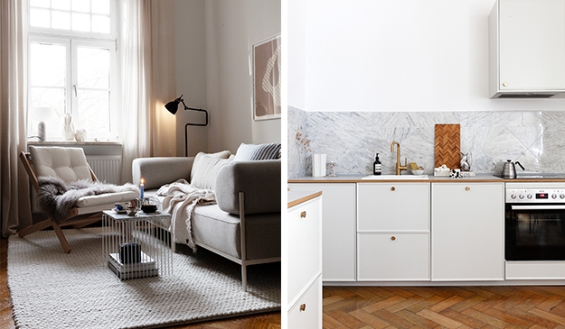
The small yet stylish apartment (Styled by Martina Mattsson, photographed by Krister Engström for Kvarteret Makleri) used to have a large kitchen space, which is now divided by a glass partition to create both a cooking and sleeping space.
The light grey kitchen is compact yet packed with storage and functionality. The historic kitchen modules next to the window are now used to store clothes.
The living room is painted in a subtle sage green wall color, giving it a fresh appearance. The living space combines both a dining space and a sofa area.
The kitchen and bedroom are separated by a half-glass wall
A half-glass partition separates the sleeping and cooking areas from each other. This way, even though the kitchen doesn’t get any direct sunlight, ample natural light flows into both rooms. The bottom part of the glass partition is solid, allowing for a shelf attachment that creates extra countertop space.
The light grey cabinets are paired with a stainless steel countertop, stainless steel appliances, and chrome hardware for a classic look with a modern touch.
The bedroom section behind the glass has shiplap walls, which gives this space a slight farmhouse look.
What used to be storage for the kitchen is turned into a wardrobe for the bedroom.
The back wall of the kitchen is treated with beautiful floral wallpaper, adding extra character to the space.
A living room with subtle sage green walls
The living room has a very subtle and light sage green wall color, giving the space a fresh look. The warm and dark tones stand out against this wall color and the sheer beige curtains in front of the window warm up the daylight coming in.
A custom bookshelf next to the doorway offers a great spot for books and accessories. It has been painted in the same color as the walls to make it blend in.
A vintage dining table and chairs stand out on top of the white flooring used in the space.
Styled by Martina Mattsson, photographed by Krister Engström for Kvarteret Makleri
Posted inInterior Inspiration|Comments Off on Small flat with the bedroom behind a glass partition in the kitchen
Incorporating appliances into kitchen islands is a great way to improve the usability of kitchens of all sizes. The positioning of your stove, sink, and refrigerator can greatly affect the ease and efficiency of meal prep, and kitchen islands can be a major factor when laying out that work triangle.
Below you can find the most amazing kitchen island ideas that will serve as incredible inspiration for your kitchen remodel and show you exactly why placing your stove on the island just makes sense.
A Black and White Kitchen With Marble Countertops and Bar Stools at the End of the Island
This white marble countertop does a fantastic job of incorporating seating in addition to the stovetop. The location of the stools in relation to the stove makes serving casual meals a breeze and is great for entertaining guests while cooking a meal.
Additionally, since the counter space by the sink is limited, the kitchen island ensures there’s enough room to keep the kitchen functional.
A Peninsula-Style Kitchen Island With a Range Hood in an Open Concept Room
This island creates a visual divider between the kitchen, dining table, and living space which is often needed in an open-concept room. However, to conserve floor space in the kitchen and facilitate movement, the kitchen island is just wide enough to fit an electric cooktop.
The black range hood helps with the visual separation and ensures any smoke or steam is whisked away.
A Stunning Marble Kitchen Island With Solid Colored Cabinetry and a Herringbone Floor
One way to make your kitchen island stand out is to use a striking material against a plain, flat cabinet finish. This island, as well as the recessed space centered in the cabinetry, is sure to impress guests.
The positioning of the cooking surface in relation to the sink means that any pots and pans used for meal preparation can immediately go into the sink to soak.
A Traditional-Style Kitchen With a Full-Size Gas Stove in the Island
This kitchen design has a slight rustic feel with cottage and farmhouse elements peppered throughout. The full-size stove makes this the perfect kitchen island for cooking a wide variety of dishes. A brass-edged range hood and Edison bulb pendant light add dimension and strengthen the overall theme and styling of this kitchen.
A Small Square Marble Kitchen Island Paired With Dark Cabinetry and an Electric Stove
This small island perfectly fits the size of this kitchen and provides sufficient space for food prep. The marble countertop and backsplash add visual interest to this small kitchen, especially when placed against the dark cabinets.
As with other kitchen island ideas, the location of each element in relation to each other makes meal prep quick and easy with everything being just a step away.
A Small White Kitchen With Open Shelving and an Island With Pendant Lights
This kitchen layout also optimizes the work triangle, placing the stove and sink across from one another. The island has just enough space to house a full-size cooktop with room on either side for cooking utensils and dishes to be at the ready.
A pair of small lights above help make sure that everything is well lit and open shelves on the wall keep commonly used items within reach.
A Table-Style Kitchen Island With Storage Space and Built-In Appliances
The extra space provided by the deep drawers of this kitchen island design compensates well for the lack of wall cabinets. Electrical cords connecting to the stovetop are cleverly hidden within the island to create a seamless look and an elevated design. Overall, this island perfectly blends the latest trends with traditional aesthetics.
A Dark, Dramatic Kitchen Island With Matching Counter Stools and a Large Cooktop
As we’ve previously seen, kitchen islands don’t have to be made of the same materials as the rest of the counters. This island, however, approaches this concept with peak contrast in mind. Solid, intense black covers the island and its stools to add depth and prevent the space from feeling flat.
A silver wine fridge, gold-toned faucet, and sleek black stovetop work together to enhance this effect.
A Neutral Color Scheme With an Integrated Cooktop in the Kitchen Island
This open space is full of neutral tones and natural wood finishes alongside new kitchen appliances, blending modern and traditional touches.
Where some kitchen islands may stray away from the established counter design, this island maintains the theme for a cohesive look that allows other elements of the space to shine. In this case, the square picture window is placed front and center, inviting you to enjoy the view.
A Large Island for Extra Counter Space and Casual Seating
Thanks to its size, this one island serves multiple purposes and is large enough to include things like a mini fridge and other appliances.
Many of the kitchen islands we’ve seen so far have both the stovetop and oven located together, but the separate appliances used here provide additional storage space and functionality. The pale wood finish that’s carried throughout the space creates an understated, peaceful environment.
White Countertops and a Full Size Cooktop With Kitchen Island Seating
This thinner kitchen island separates the dining area from the cooking space in a natural way. The additional storage created by the open shelves on the end of the island provides the perfect place to display decorative items or store materials that need to be easily accessible. Comfortable stools create an ideal spot to have a casual meal or talk with guests.
A Thick Marble Kitchen Island With Black Accents and Small Appliances
This bold and commanding marble island is the perfect addition to this marble and wood kitchen. The thick marble slab used for the countertop allows the stovetop and its components to all be housed inside with only the knobs showing, creating a sleek appearance.
Simple black stools sit at one end and are the perfect height for the counter space to act as a casual dining space. Appliances built into the cabinetry and an undermount sink complete the work triangle.
A Peninsula-Style Island in a Small Kitchen With Integrated Storage and Timeless Decor
This simple white island provides extra storage in addition to housing the stove, maximizing the usability of the room. The smooth, low-profile cooking surface almost goes unnoticed in this peaceful kitchen full of varying shades of beige.
Where other kitchen islands stand alone, this island connects to one wall which allows plenty of space to pass around it without issue. This is especially important if there are multiple people in the kitchen at the same time frequently.
A Striking Marble Kitchen Island With Bold Veining and a Recessed Area for Stools
For kitchen islands that make an impact, imposing marble slabs with thick veining patterns are the way to go. This island makes its presence known while bringing an undeniable sense of luxury into the kitchen.
A flush stove and simplistic stools are careful not to overpower or hide the beauty of the marble, and understated, mildly abstract decor pieces help to tie the marble in with the wooden cabinetry.
A Dark Kitchen Island Design With Steel Countertops and a Multipurpose Cooktop
Stainless steel countertops are becoming increasingly popular for use in residential kitchens due to their appearance and unmatched durability. This kitchen uses stainless steel for both countertops and the backsplash.
Though two different countertop materials would work in this space, keeping a consistent kitchen counter material strengthens the sleek appearance. The built-in stove has multiple zones meaning that you can have multiple different processes happening at the same time using the same appliance.
An Elegant Stone Kitchen Island For a Centrally Located Stove With Pendant Lights
This kitchen island is a great example of why placing a main appliance on the island has multiple benefits. By choosing to put the stove on the kitchen island, you also leave room on the surrounding countertops for things like a breakfast bar or coffee area.
Additionally, as shown here, this placement can make the stove the centerpiece of the kitchen, putting it at an equal distance from all of the other elements of importance.
A Unique Wood Kitchen Island With Rounded Edges and a Seamless Cooktop
Similar in appearance to butcher block countertops, this oak island is a stunning centerpiece to this kitchen. Unlike butcher block kitchen islands, however, this island uses two different tones of wood and sports rounded edges.
The matching flooring and cabinetry create an atmosphere that matches a rustic cabin, but the modern features help the room feel up-to-date and relevant.
A Grey and White Kitchen Island With a Large Range Hood for Proper Ventilation
If you want to make sure your kitchen is properly ventilated, a large range hood extending down from the ceiling can help.
By placing the stove, and by extension the range hood, on the island, you can reserve space for wall cabinetry elsewhere. This is a huge bonus for anyone who needs that additional storage.
This small yet smart studio apartment (via Entrance Makleri) makes use of the turn-of-the-century building’s available height to make the layout work. The kitchen and living area are located right in front of the window.
The loft bed is built on top of the bathroom right next to the entrance. This allows for all basic functionalities to be packed on a relatively small floor plan, which is doable if you have ceiling height to work with.
The sofa area is placed opposite the kitchen, with a small dining table in between both areas. The soft rug helps to visually separate the functional areas from each other.
A vintage desk and chair are placed right next to the sofa, contrasting nicely with the light grey walls in the room.
A loft bed above the bathroom with integrated hallway storage
The loft bed is built on top of the bathroom and is accessible with a ladder mounted against the wall. There is just enough space available next to the vintage desk for a storage solution for jackets and shoes.
The wardrobe solution is integrated within the loft structure and allows for both open and closed storage space.
On the loft itself, only a double bed is placed right below the ceiling. It’s quite cramped up there, which could be solved by picking out a lower bed if you prefer.
All book lovers dream of a home library designed with built-in bookshelves to house their book collection. But having a separate room just for book storage is often unattainable by the average person.
However, there are still plenty of home library ideas out there that can help you channel your inner interior designer and work within the square footage you have to create a space worthy of curling up with a good book.
An L-Shaped Home Library Packed With Books Leading into the Bedroom
First on the list of home library ideas is a classic floor-to-ceiling design. Bookshelves surround double doors leaning into a bedroom and continue across the connecting wall.
Every inch of the shelving is filled with a variety of books in all different sizes and colors, creating a stunning collection to have on display. You could also use frosted French doors in this space for additional elegance while maintaining privacy.
White Bookshelves With a Bottom Row of Cabinets and Other Decorative Items
Similar to the previous home library idea, these bookcases frame the bedroom door. However, these shelves include a set of cabinets at the bottom of each section for additional storage of other items.
Additionally, the books here are more spaced out, resulting in a more relaxed appearance, and they are joined by other items such as photographs, dinnerware, and candles. The overall thoughtful arrangement of objects creates a sophisticated atmosphere.
Styled by Greydeco and photographed by Janne Olander, for Stadshem
Grey Floor-to-Ceiling Bookcases With Vertical Paneling for Visual Interest
This room features grey and blue tones that create a peaceful environment which is strengthened by the decorative home library. As with our previous example, the shelves aren’t packed tight with books, allowing decor items to be placed throughout.
These gaps also leave the back panel of the shelving visible, which this design has used to its advantage. Vertical paneling covers the back of the shelves, creating a pop of visual interest in the open areas.
A Section of White Square Shelves in the Dining Room
This home library uses sections of glass-fronted display cases to create a large area of even square shelves against the dining room wall. As with many of the other home library ideas, the shelves house more than just books, leaving space for accent pieces and knickknacks as well as a bottom section of cabinets to store items you may prefer to keep out of sight.
A Dark, Forest Green Home Library With Additional Built-In Storage
One of the most vibrant and traditionally styled home library ideas on our list, this library creates a cozy reading spot complete with a chessboard side table. This bold green bookshelf pairs wonderfully with the green in the wallpaper as well as the rich brown tones of the other furniture.
The overall style of the furniture, including the antique chandelier, transports you back in time while you sit and enjoy books of all kinds.
A Home Library Covering a Full Wall of the Dining Room
In line with some of the home library ideas we’ve seen so far, these floor-to-ceiling, wall-to-wall bookshelves are an excellent addition to this dining room. All of the shelves are evenly spaced to create a sense of symmetry, though the books are thoughtfully arranged in a variety of groupings and positions so that no two areas are the same.
This keeps the eye moving across the space, something that is visually appealing. Additionally, a library ladder is kept off to the side to help reach the highest areas and ensure this home library stays fully functional.
A Large Home Library in the Living Room With a TV and Other Decor
This home library takes on the role of entertainment center in this sitting room, housing a TV alongside books and other decor. By installing the shelving directly onto the wall using bracket supports, there’s additional space to fill with books and miscellaneous items.
Filling the space completely creates the illusion of floating shelves as seen in the top row here. Furthermore, the shelves themselves are painted in the same shade of paint as the walls, allowing them to blend in and better showcase the books they hold.
A Cozy Home Library Reading Nook Under a Skylight in an Attic Space
This small home library also serves as a cozy reading nook with a comfy chair and side tables. The skylight bathes the space in natural light, enhancing the cozy atmosphere and inviting you to curl up with a good book and read the day away.
Additionally, the books are lightly arranged by color, which creates a pleasing appearance for the eyes. As an added bonus, this simplistic design is easy to achieve without much heavy lifting and without needing an interior designer on sight to ensure it goes as planned. If desired, there’s also room to add a floor lamp to create a source of light for nighttime reading.
A Home Library in a Gallery-Wall Layout in the Living Room
This home library echoes the appearance of a gallery wall framing the TV, but with the added advantage of storing more items in addition to art and photographs. The mix of shelf shapes and sizes creates a variety of spaces to display a range of objects with ease.
The bookcase’s coloring works well with the cool neutral palette without overshadowing the items it holds, something that creates a subtle focal point.
A Vibrant Home Library in a Bold Foyer With a Small Table and a Single Chair
This striking foyer beautifully highlights the personality and theme of the home as you enter, welcoming guests with a mix of colors, patterns, and textures. The inclusion of bookshelves along the back wall and framing the door enhances the ambiance of this little room without taking up unnecessary floor space.
Art books, fiction novels, and historical biographies blend across these bookshelves, telling the story of the interests and passions of the home’s residents.
Half-Wall Shelves for a Small Home Library in a Sitting Room
Not all home libraries have to be grand and imposing. This understated collection behind the living room sofa allows you to showcase a smaller, more meaningful selection of books in your home.
The half-height also leaves space for displaying artwork and photos along the walls. Additionally, this size bookshelf is ideal for a kid’s room, ensuring that all of their books are safely within reach.
Large, Dramatic Bookcases Framing the Entry Way of the Home
These dark bookcases are painted in the same shade as other interior design elements in the room, such as the wainscoting, trim, and entertainment console, making the room feel cohesive.
This bold entryway is sure to wow guests as they enter the home, while also causing the living room to seem more relaxed and comfortable.
A Blend of Shelf Sizes With Built-In Cabinetry and Hanging Plants
This custom-built home library features a blend of shelf shapes and sizes, allowing endless decor possibilities. As with other home library ideas, this design can easily be customized to better suit your space and needs.
For instance, a reading nook with wicker chairs could be added to the corner, additional vining plants could be placed sporadically, or a rolling ladder could be installed directly on the bookshelves.
Subtle Bracket Mounts to Give the Appearance of Wide Floating Shelves
This home library uses many of the same elements as some of the other home library ideas we’ve seen so far but adds unique touches to create something new.
The bracket-mounted shelving still produces the appearance of a floating shelf, but the contrast between the color of the shelving and the wall allows the shelving to stand out more, resulting in a slightly different visual effect.
Multipurpose Bookcases as a Room Divider and Display Area
This home library performs double duty as a book storage solution as well as a room divider. These bookshelves help create a clear separation of rooms in an open-plan space but do so purposefully. Additionally, both the books and the decorative items fit the color scheme for a cohesive look.
Floor-to-Ceiling Bookcases With a Library Ladder in a Room With a Vaulted Roof
A vaulted ceiling in the living room is the perfect excuse to grow your collection and create a stunning home library. The attached rolling ladder is every book lover’s dream, allowing you to reach every corner of the space with ease.
This is the classic style people around the world picture when thinking about home libraries.
Bookshelves Framing One End of a Window Seat for a Cozy Reading Nook
For the final example in our list of home library ideas, we have bookshelves framing a cozy reading spot positioned just under a window. This style of home library is sure to please all ages, serving as the perfect addition to a child’s bedroom or an adult’s office space. No matter where you create this in your house, a reading nook such as this is always a hit.
This gorgeous turn-of-the-century apartment in Sweden (Styled by Anna van Keppel, photographed by Dana Ozollapa for Historiska Hem) has eye-catching pink walls in the kitchen, making this space the most unique room in the apartment.
The soft pink walls are paired with a modern off-white kitchen with a unique terrazzo countertop. The vintage-style table in the middle of the space stands proudly next to the old doorway that has now been transformed into a shelf for glass and dinnerware.
The living room and the adjacent bedroom have two-tone walls, giving both spaces a unique look while maintaining a modest color palette.
Pink kitchen walls paired with off-white cabinets and a terrazzo countertop
The walls and doorways in the kitchen have all been painted in the same subtle pink wall color that pairs wonderfully with the hardwood flooring and gives the space a cohesive look.
The off-white kitchen cabinets complement the wall color, while the modern terrazzo countertop gives the kitchen design a bold look.
The small kitchen design fits perfectly within the niche spot between the wall and window.
A small round dining table fits perfectly in the niche spot in front of the windows. The brass pendant light above the table reflects the space in a lovely way.
What used to be a doorway has been transformed into a shelf for glass and dinnerware. The placing right next to the dining table is very convenient and the pieces stand out nicely against the pink paint color.
The artwork at the entrance of the kitchen matches the color palette perfectly.
A living room with two-tone walls and a modest color palette
The spacious living room has a neutral color palette with a few colorful details here and there to finish off the look. The bottom of the walls are painted greige, while the upper area is white for a wonderful two-tone look.
By hanging the picture frames slightly above the line where the two paint colors meet, the two paint colors are accentuated nicely.
The pink kitchen wall color can be seen from the living room.
A two-tone bedroom makes the small space unique
The small bedroom next to the living room has a two-tone wall design as well, yet the white color block is on the bottom. The top area is painted in a dark blue wall color, which makes for an interesting effect when looking in through the living room.
Kitchen islands create a natural focal point in the room, so it makes sense that many people want their island to feature at least one of the main elements of the room.
A kitchen island sink is one of the most popular choices, both as the main sink of the room as well as a second sink to help separate dirty dishes from prep work. Below, you’ll find the most beautiful kitchen island sink ideas to serve as a source of inspiration for designing your dream kitchen.
A Waterfall Countertop With a Sleek Black Undermount Sink
This kitchen island follows the sleek, dramatic design style found throughout this home. Waterfall edges create a luxurious feel while showcasing the pattern of the countertop. The black cabinets and integrated cooktop allow the island to be fully functional, and the black sink and matching modern faucet pair wonderfully with this design, maintaining the theme and blending into the surroundings.
A mix of decorative items placed thoughtfully across the kitchen counter brings depth and visual interest into the space.
A Grey Traditional Kitchen Island With Marble Countertops and a Brass Undermount Sink
This traditionally styled kitchen layout is full of tones of grey and brown, making the brass island sink the perfect addition to the space. A matching undermount sink and cabinet hardware further pull the room together, creating an elegant space.
The design style of the island itself provides an area to sit as well as additional storage at one end. The mix of drawers and cabinets ensures that everything has its place, with utensils and dinnerware staying within reach while food prep occurs just steps away.
An Additional Smaller Sink in the Kitchen Island to Make Meal Prep a Breeze
Sometimes, just one sink doesn’t provide enough room for cooking, cleaning dishes, washing hands, etc. This is especially true if you live in a house that hosts family and friends often. That’s why many homeowners are choosing to include an additional kitchen island sink in their designs.
An extra sink can allow you to cook without worrying about dirty pots and pans taking up all of your sink space. This kitchen island features a small sink on the far end, leaving room for a cutting board so things like produce can be washed, prepared, and added to a meal easily.
An Understated Nickel Double Basin Island Sink Across From the Cooktop
Placing a double basin sink on a kitchen island across from the cooking area is a great way to ensure that both areas have room for all the items you’ll be using at each station. You can easily switch back and forth between tasks quickly, ensuring that the other side isn’t left unattended.
A double basin sink under-mounted to quartz countertops helps to maintain a streamlined appearance to the counter space while also providing the extra space a two-sink kitchen has without requiring extra space.
Two Sinks and a Large Kitchen Island for Extra Counter Space
This large, open kitchen features an island with an abundance of counter space and a recessed area perfect for bar stools. The island and back counter are fully covered in the same countertop materials, creating a cohesive style.
This is another two-sink design, with the kitchen island’s sink being slightly smaller than the main one. Its position also allows the other end to serve as a seating area for quick, casual meals.
A Farmhouse Sink With a Gold Faucet in a Kitchen Island
Farmhouse sinks are a popular choice for kitchen islands, adding an instant cozy, cottage-esque style to any house. This farmhouse sink perfectly matches the classic styling of this kitchen with its gold hardware in a timeless design.
The kitchen island itself offers plenty of counter space as well as storage, something that is ideal for anyone who loves to cook. The rest of the kitchen features hardware in the same gold tone and other matching materials for an easy sense of style.
A Black, Double Sink Layout With Natural Wood Cabinets
This kitchen island with sink blends a few design elements that we’ve already seen, such as bar stools for extra seating, two sinks, and thoughtfully arranged decor. The neutral color palette creates a calming, relaxed atmosphere while the black accents frame the space, leading the eye deeper into the kitchen.
This long island is great for entertaining family and friends on any occasion. Additionally, the layout, as well as the multiple sinks, lends itself well to having more than one person cooking at a time.
A Bold Stainless Steel Kitchen Island With a Second Sink
Similar to butcher block countertops, stainless steel countertops have been gaining popularity for use in residential kitchens. This kitchen takes the advantages of this material to the next level, making a bold statement and placing the island at center stage.
The built-in sink provides extra functionality to the kitchen while echoing the other sink to tie these two contrasting elements together. The faucet shape used in this kitchen is also fairly modern, further suiting the feeling and design of the space.
An Extended Kitchen Island With Sink and Built-In Seating
This natural wood kitchen offers an abundance of storage, including drawers, cabinets, and open shelving built into the face of the island. The island also includes a seating area perfect for eating meals in a more casual setting.
A black sink and faucet pair well with the rest of the appliances, blending with their surroundings for an understated appearance. The row of small lights hanging above ensures the island is well-lit, and contemporary decor helps the kitchen feel full and lived-in without becoming cluttered.
A More Traditional Kitchen Island With Sink in an Open Concept Space
This traditionally designed white island and timeless faucet are excellent sources of subtle, classic styling, while the undermount sink adds a touch of modernity. The orientation of the island is the perfect solution for making visual division in an open-concept home, something that islands are often used for.
Brushed nickel hardware is used throughout the kitchen area, matching the faucet without minimizing its uniqueness.
A Bold Red Kitchen Island With a Small Sink and Gold-Toned Faucet
For a bold kitchen island, try a daring solid color and a unique countertop with a muted gold faucet. This stunning island is right at home in this eclectic kitchen, perfectly matching the atmosphere created by the colored ceiling, striking artwork, and vibrant plant life.
Overall, this kitchen is bursting with personality and this style is a fantastic way to show off your own uniqueness and creativity in a meaningful way.
The Only Sink Positioned on the Side of the Kitchen Island to Allow for Plenty of Cooking Space
This kitchen island places the sink on one end and the cooktop on the other, leaving space between the two for food prep. The rest of the appliances are hidden from view, which helps this kitchen appear more streamlined and organized.
Additional storage in the island is always a fantastic bonus, and textured glass cabinets allow you to display your dinnerware in a way that appears purposeful and doubles as decor without taking up the needed space.
A Dark Brown-Black and White Kitchen With a Sleek Stone Island and Gold Accents
This gold faucet and one-of-a-kind pendant lights above the island are the only sources of color in this monochrome kitchen full of textures, making these items stand out even more. The solid stone kitchen island cuts a sleek and imposing line through the middle of the space, resulting in a modern, luxurious style.
Overall, this kitchen island is a statement piece that isn’t as intense as some of the other options we’ve seen. This makes for a more simplistic kitchen that maintains touches of glamorous as well as industrial styling.
A Small Kitchen Island With a Standard Size Sink and Extra Storage
This smaller kitchen with stainless steel appliances has limited space on the counters, so an extra large sink would be overpowering. This means that while the sink here is on the small side in comparison to some of the other examples we’ve seen, it’s the ideal size for this kitchen island.
The island also supplies plenty of storage, helping to ensure that the counters aren’t cluttered with unnecessary items. The mix of hardware colors adds a touch of charm that’s matched by the inclusion of multiple plants.
A Bold Blue Kitchen Island With Stainless Steel Countertops and a Built-In Sink
This is probably the boldest design on the list of kitchen island sink ideas: a striking blue and white kitchen with stainless steel countertops. The daring blue accentuates the uncommon shape of the kitchen which, in turn, allows the island to stand out even more.
The sink is positioned in the center of the island, something that works well with the sloped ceiling. Large open shelves in the front of the island provide the perfect place to display a range of decor pieces that bring depth into the space.
This gorgeous turn-of-the-century home (styled by Emma Fisher and Annica Clarmell, photographed by Henrik Linden for Alvhem) has a connected kitchen and living room, with a historic double interior door in the middle of the spaces.
The two-tone kitchen has dark oak cabinets on the bottom paired with white upper cabinets and a white terrazzo countertop. The cupboards opposite the window hold the larger appliances and provide lots of storage space. The middle of the kitchen features a spot for a large dining table with natural oak chairs.
The adjacent living room has a muted peach color on the walls, highlighting the white sofa and crown molding underneath the ceiling.
A two-tone kitchen combining dark oak with white cabinets
This two-tone kitchen has a high contrast between the upper white cabinets and the dark oak cabinet doors on the bottom, resulting in an interesting look. The light terrazzo countertop adds a subtle yet beautiful texture to the natural grain of the cabinets.
Three large cupboards on the side of the kitchen hold the large kitchen appliances and offer ample storage space.
The large dining table with natural oak dining chairs in the middle of the space is paired with a warm-toned sculptural pendant lamp to finish off the color palette.
The kitchen walls are painted in a subtle light beige wall color, which complements the adjacent living room palette perfectly.
Peach walls and a natural color palette in the living room
The subtle peachy living room walls are paired with warm tones in the textiles and a white sofa that brightens up the space. A glass coffee table on top of a beige fluffy area rug complements the warm red and beige tones in the pillowcases.
A reading nook with a wall bookshelf fills the corner of the living room perfectly.
The TV attached to the wall is paired with a low oak shelf for storing books and accessories.
A green-grey bedroom with a wardrobe painted in the same color as the walls
The green-grey wall color of the bedroom is accentuated by the fresh green plants on the balcony and next to the bed. The wardrobe is painted in the same color as the walls, making it blend in nicely.
Limestone tiles in the bathroom paired with an oak vanity
Yellow sofas are the perfect way to add depth to any living room, easily drawing the eye to the natural focal point of the space. However, designing a room around yellow sofas can seem daunting at first glance.
The bold coloring can present a whole host of interior design challenges when approached incorrectly, leading many people to abandon the idea altogether. In the list below, you can find the most inspiring yellow sofa styles to provide you with the inspiration you need to create the perfect living room for your home.
A Warm, Mustard Yellow Sofa in a Cozy Living Room With Contrasting Textures
This living room with neutral walls provides the ideal backdrop for a cozy and simple, yet sophisticated, design. The mustard sofa stands out without seeming overpowered, and the painting above it echoes its tones.
White and black pillows create just enough contrast to make the scene visually interesting while also tying into the other elements in the room. The mix of fabrics and textures helps the space appear even more soft and inviting.
A Dark Yellow Sofa With Abstract Living Room Decor
Blending sharp and soft lines with a bit of texture is a great way to decorate when looking for a timeless style for your interior design. This dark yellow-brown sofa has a mild copper/brass undertone that pairs well with the base and stem of the lamp as well as the wooden stool.
A sense of sophistication is created by these elements working together alongside the textured artwork on the wall.
This eclectic living kitchen with mint green kitchen cabinets and a beautiful variety of furniture pieces is enhanced with a velvet mustard couch that completes the look perfectly. The yellow tone of the sofa comes back in the artwork on the wall above it, which is a nice touch.
A Bold Yellow Sofa and Pops of Blue With Multiple Statement Pieces
From the small table in the center of the floor to the electric blue lamp shade, this living room design strikes the perfect balance between retro and contemporary styles.
The bold yellow sofa immediately pulls you into the space while the pops of blue shades throughout help draw your eyes to all the different elements on display here. With multiple statement pieces and abstract designs, this living room is bursting with personality.
A Darker Brown-Yellow Sofa With Mismatched Throw Pillows and a Gallery Wall
This living room creates a commanding focal point centered on the yellow sofa by mounting a TV above it as part of a TV gallery wall with a mix of art styles.
The warmth created by this scene is welcoming, creating an atmosphere that is both elegant and comfortable. A simple throw blanket and pillows enhance this feeling, inviting you to sit, relax, and enjoy the natural light coming from the window.
A Pale Yellow Sofa in an Industrial-Style Room With Brown Walls
This pale lemon-yellow sofa is the epitome of chic interior design and contrast. Combined with the dark, textured brown walls, the sofa paired with its accompanying chair stands out from its surroundings.
This showcases their warmth and style in a way that can’t easily be replicated in a room with light-colored walls. All of these elements, as well as the unique pendant lights, result in a distinct air of luxury upon entering the space.
A Muted Yellow Sofa in a Living Room With Grey Walls and Decor
For a more subtle — yet still visually interesting — design style, try a muted mustard sofa in a predominantly grey living room. This flat grey shade is carried throughout the room, which allows the yellow of the sofa to act as a source of depth, breaking up the space and enhancing the layered appearance.
Abstract block art prints on the wall perfectly complement this palette, creating an understated elegance overall.
A Pale Yellow Sofa Surrounded by Neutral Tones and a Wealth of Natural Lighting
This living room features multiple mid-century modern design ideals that highlight the yellow sofa beautifully. The style of windows and arrangement of the furniture work together to bathe the inside of this house in sunshine. This room perfectly blends touches of traditional, retro, and chic styling for a peaceful space that serves both form and function.
A Yellow-Orange Sofa in a Living Room With Contrasting Shapes, Patterns, and Textures
Bright pillows, soft cushions, and a range of textiles decorate this living room. This style allows the couch to be part of the scene without making it stand out, something that prevents the other elements from becoming overwhelming.
Instead, the unique coffee table and raised-pattern rug are the first details to grab your attention, with the rest of the living room coming into focus as your eyes travel through the space.
A Subtle Yellow Sofa in a Sleek Living Room With Two-Tone Walls
This sleek, understated yellow sofa is once again framed as part of the overall living room design instead of the focal point. Other, equally sophisticated, elements are given equal footing here and allowed to create their own inspiration in the space.
Two-tone walls divide the vertical areas with a similar effect to that of wainscoting, a bold style choice that truly pays off. However, the pale lemon yellow of the sofa still holds its own with smooth, plump cushions enticing you to take a seat.
A Dark Mustard Sofa in a Compact Space With Beige and Brown Tones
This small sofa is the perfect addition to this compact living room. Its low profile works very well with the size and shape of the room, while the color itself is subtly echoed in other decor.
Additionally, the tone of yellow is distinct enough in the space to help draw a clear line between the kitchen/dining area and the living room with a little assistance from the rug.
A Striped Yellow Sofa With Matching Yellow Furniture
One way to fully embrace a bright and cheerful home is to fill your space with bold yellow furniture. This striped cream and mustard sofa is surrounded by furniture in similar shades to create a cohesive yellow living room.
The result is a bold and sunny room that breathes life into the interior design of the whole house. A pot of sunflowers brings a floral touch while staying on theme.
A Deeper Mustard Sofa as a Source of Color in a Monochrome Space
This slightly slouchy mustard sofa helps to create a casual, lived-in vibe in this living room. With most of the accompanying decor falling into the black and white color families, this yellow sofa acts as a source of warmth and color.
The mid-century and contemporary styling of the elements of the room come together into an instantly classic design that is sure to stand the test of time.
A Mid-Century Modern Yellow Sofa in a Stark Industrial Room
If you’re looking to bring a pop of color into a spartan room, a sun-yellow sofa might be the answer. The grey wall and floor with the coppery-brown wall to the side provide the ideal backdrop to showcase this fun yellow sofa with wooden legs. A silver wire table allows for a subtle storage or display area without distracting from the sofa itself.
Matching Yellow Sofas Facing Each Other Surrounded by Grey Walls
Parallel sofas are a great way to create additional seating in a smaller living room. The matching sofa on either side of the room with a coffee table in the middle invites conversation, an excellent choice for anyone who enjoys hosting friends and family.
A Bright Yellow Sofa in a Bright and Airy White Space
Living rooms that double as home offices can also benefit from yellow sofas. This open, bright white room allows for plenty of work to be done without requiring a separate room for entertaining.
The bright lighting in this room makes the lemon-yellow sofa pop, ensuring that it’s the center of attention at all times.
Warm and inviting living room with a mustard yellow couch
This living room features a mustard-yellow couch as its vibrant centerpiece, instantly adding warmth and personality to the space. The natural wood accents, layered textiles, and soft sheer curtains contribute to a cozy and relaxed feel, while the red and pink checkered rug introduces a touch of playful contrast.
A cozy living room with a yellow velvet couch and warm tones
This lively space centers on a mustard yellow velvet couch that brings comfort and style. The soft pink walls and sheer curtains create a warm and inviting atmosphere. Colorful artwork, plants, and accessories add character to the space. A glass coffee table with chrome legs adds a modern touch to the room, complementing the cozy textures of the rug and throw pillows.
This gorgeous turn-of-the-century home for sale in Sweden (Styled by Emma Fisher, photographed by Anders Bergstedt for Alvhem) has white-painted hardwood flooring, paired with a light grey paint color on the walls and a dark grey paint on the historic window frames.
The kitchen and living room are connected with classic double doors. The doorway on the living room side is treated with custom shelving adding both storage space and a unique look to this room.
The L-shaped kitchen with dark grey cabinets stands out against the white subway tile backsplash that goes up to the ceiling. The kitchen is spacious enough to leave a large spot in front of the window for a large dining table and an oversized artwork.
A spacious living room with a bookshelf built around the door
The bookshelf around the door takes front and center in this otherwise modestly decorated living space. The white sofa is paired with a contrasting black coffee table. Green plants by the window and on the bookshelf add a fresh touch to the palette.
Two cognac leather armchairs and various pillowcases on the sofa add a beautiful warm element to the setting.
A dark grey L-shaped kitchen and a spacious dining area
The floor plan of the kitchen is rather large as well, with ample space for a large dining table in front of the window. The light grey walls make the black accent furniture pieces and the dark grey kitchen stand out powerfully.
The kitchen is planned out in an L-shaped layout, filling the space and allowing for bottom cabinets only.
The dark grey cabinets are paired with chrome hardware, a stainless steel countertop, and an impressive white subway tile backsplash.
The black dining table in front of the window is paired with black bentwood chairs, a black vitrine, and black tones in the large artwork on the wall.
A light grey bedroom with clothing storage built into the wall
The light grey color is carried over into the bedroom, where it’s paired with subtle black accents and a mixture of beige and grey textiles.
The colorful artwork above the bed adds a subtle colorful element to the space.
The wardrobe has been built into the wall, with the doors painted in the same color as the walls for an integrated effect.
A small workspace on the other wall makes for a cute home office spot.
Sloped ceilings and limited vertical space can pose a number of design challenges, especially in a kitchen. At first, the idea of creating a functional kitchen when faced with sharp angles can seem impossible. But with the right layout in mind, you can lean into the challenging architecture and create a magazine-worthy kitchen in your home.
In the list below, you’ll find the most beautiful attic kitchens to help you feel inspired for your next renovation.
A Grey Corner Kitchen With White Walls and Lots of Natural Light
This simplistic U-shaped kitchen design works with the unique shape of the room and places the sink in front of the window to ensure that each of the most used areas has the vertical space they need.
The neutral grey tone of the cabinetry creates a peaceful, relaxed environment, while the white walls help to amplify the bright light pouring through the windows, opening up the space.
One advantage of the limited wall space created by a sloped ceiling is the ability to use the area to make a statement. Marble is among the pricier kitchen materials, making it infeasible for many to include a trendy bold marble wall in their kitchen.
A sloped ceiling, however, allows you to add this elegant touch to your home for a fraction of the cost. Open shelves made of the same material provide additional functionality where full cabinets wouldn’t be possible.
Featuring a more mild angle to the ceiling, this kitchen allows for standard-sized upper cabinets to be installed to fit the angle of the ceiling. The dark wood finish in combination with the limestone countertops results in a timeless style that can pair well with any future design trends with minimal effort.
The open wall space to the left of the cabinets is balanced by the accessories on that end of the countertop, but the area could also serve as a place to display photos or host a small shelf as well.
A One-Wall Kitchen Layout That Works With the Sloped Ceiling Design
This extended one-wall design places the most frequently used items away from the lowest area of the ceiling, working with the design instead of against it. The wide-open space in this room allows for tall wall cabinets with plenty of storage. The final cabinet is custom-fitted to the angle of the sloped ceiling, helping to create a seamless interior design solution.
A Compact Kitchen Nook With Light Toned Cabinets and Black Appliances
This interior design style embraces the shape and size of the kitchen area, using a combination of shelf and cabinet orientations to fill the space and provide as much storage as possible. The result is a cozy small space that’s perfect for preparing food in a one- or two-person house.
A neutral palette keeps the room feeling open and airy, something that’s ideal for an area that is difficult for natural light to reach.
A Fun White Space With Blue Cabinetry and Stainless Steel Counters
This bold, exciting kitchen creates a bright and fun atmosphere in the home. The stainless steel counters, electric blue paint, blue accent pieces, and kitchen island with wide-open spaces are a study in creative, personality-driven interior design. The eye is led through the space by the blue, showcasing the unique shape of the room and its layout.
A Minimalist Design With Light-Colored Natural Wood
For a simple, understated kitchen, try pairing a grey counter with light wood cabinets and a narrow shelf. This small, open-concept kitchen is situated in a studio apartment, meaning that space is even more limited here.
By sticking to a simple, neutral color palette with natural materials and minimal decor, the room easily avoids feeling crowded which also helps the space seem larger.
These trendy, yet timeless, white cabinets paired with a single pendant light create an easy, contemporary interior design. The dormer window creates a skylight effect with help from the light-colored walls, brightening the room easily. By placing the table in front of the window, you can enjoy the view while eating meals.
A Blend of Textures and Brown Tones to Highlight a Vaulted Ceiling
High ceilings and exposed beams are an interior design classic. This kitchen takes full advantage of this extra space by featuring dark, almost black, cabinets and a matching kitchen island. The tone of the wood cabinets matches that of the ceiling design, tying the room together.
All of this combines to make the sloped ceiling nearly invisible, though open shelves ensure that wall space doesn’t go completely unnoticed.
Open Shelving and a Tall Marble Backsplash in an Off-White Kitchen
This kitchen design uses a combination of cabinets and open shelves to create 90-degree corners, adding structure and symmetry to the room. In doing so, it re-frames the challenging ceiling into a purpose-built feature that brings visual interest into the space.
The tall marble backsplash helps connect the upper and lower cabinets without unnecessary additional lines or textures breaking up the smooth transition.
Styled by Copparstad, photographed by Boukari for Historiska Hem
A Bright White Open Concept Kitchen Showcasing Natural Light
This vaulted ceiling with skylights paired with an open-concept kitchen layout bathes the space in sunlight, placing the architecture and interior design center stage.
This kitchen features plenty of space to store all of your pots, pans, dishware, and utensils when they aren’t in use, allowing for a peaceful and clutter-free room.
A Large Kitchen With Plenty of Storage Space and Exposed Beams
Finally, this interior design idea pairs high ceilings and exposed beams with a large, L-shaped kitchen layout. The resulting kitchen features a mix of drawers and cabinets with a fully functional work triangle to make preparing meals a breeze. The bar stools add a pop of color to the space, tying in well with the floral counter decor.
Maximizing Functionality in an Attic Kitchen Layout
This charming attic kitchen proves that a sloped ceiling is no obstacle to a fully functional cooking space. Custom cabinetry adapts perfectly to the ceiling angle, providing ample storage and maintaining a clean aesthetic. The combination of white tiles with dark grout adds a modern touch and enhances the visual interest in the compact layout. Brass hardware and mixed-tone lower cabinets elevate the overall design, making this attic kitchen both stylish and efficient.