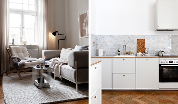
This cozy flat with beige walls and a warm color palette (Styled by Clindholm design, photographed by Therese Jahnson for Historiska Hem) has a layout that pairs a lot of functionality on a small surface.
The open-plan living room includes a sofa area, dining table, and a kitchen with walnut cabinets that are custom-fitted on a small surface. The combination of upper and lower kitchen cabinets in the kitchen niche spot allows for an optimal combination of countertop space and closed storage.
The small bedroom includes a walk-in closet and the entryway of the apartment is fully packed with custom storage solutions as well.
A functionality-packed living kitchen with beige walls and walnut kitchen cabinets
The open-plan living room and kitchen are painted with an elegant beige tone, that adds a warm base tone to the color palette of the apartment. The white fabric sofa on top of the white area rug makes for a cozy seating area and the blue fabric chair adds a wonderful pop of color.
The open shelving on the wall above the sofa reaches up to the ceiling, allowing for lots of storage space for books and decoration objects.
Across from the sofa, you can find a small bench with a TV and a beautiful collection of carefully selected artworks and objects.
The living room window is fitted with sheer beige curtains that warm up the daylight coming into this small apartment. The small black dining table with the natural oak dining chairs fit perfectly in this assymetric section of the living room floor plan.
Opposite the window, you can find a niche space that is optimally filled with kitchen cabinets to make the most out of this rather small floor plan.
The walnut kitchen cabinets are paired with a beige limestone countertop and white upper cabinets that pair well with the beige wall color in the space.
The wall space above the sink is kept free of upper cabinets, and two beautiful glass bulb lamps adorn this spot.
A small bedroom with an assymetric floor plan and a walk-in closet
The bedroom lays right next to the living room dining area and has a slightly asymmetric floor plan. The wall color is the same as in the rest of the apartment and serves as the perfect backdrop for the warm wood chair and the pink bedspread to pop out.
The beige and white textiles on the bed and the textured area rug on the floor blend in with the wall color, for an elegant and minimal appearance.
A non-bearing wall separates the sleeping area from the walk-in closet, allowing the clothes storage to be stored out of sight.
A combination of open and closed storage modules fills the area and a few pops of orange add a bit of color.
An entryway with custom storage
The open entryway of the apartment comes out into the living kitchen of the apartment, bringing up the need to have a closed storage solution to avoid things looking messy.
A custom storage closet with closed and open compartments fits the entryway space perfectly. By painting it in the same color as the walls, it blends in perfectly.
A bathroom with beige limestone and shower niches
The modern bathroom is covered with a beautiful beige limestone on the walls and flooring, finished with chrome hardware for an elegant, yet contemporary look. The natural wood vanity adds a warm element to the bathroom color palette.
The shower features shelves made out of the same stone material as the walls.
This small open-plan apartment (Styled by Mabel Market, photographed by Alen Cordic for Nya Kvadrat) consists of two rooms, with the kitchen in the middle of the layout. The shared living and sleeping space has a light grey wall color, which brings out the muted purple color of the velvet couch in a wonderful way.
A beige curtain separates the sleeping and living space and the corner layout wardrobe adds more visual separation between the two areas. The neutral color palette in the art prints, furniture, and accessories perfectly complements the room.
The small light grey kitchen is paired with a round dining table with bentwood chairs and the room on the other side of the open-plan kitchen has an eye-catching black wall color.
A living room with light grey walls and a muted purple velvet couch
The cool undertones in the muted velvet purple sofa contrast against the warm tones in the smaller furniture pieces and the beige curtain that separates the functional area in this multi-purpose room. The small gallery wall above the sofa adds a unique character to the setting.
The grey wool rug matches the light grey wall color in the space and provides a soft layer to the setting providing the space with a cozy look and feel.
The sleeping area is separated from the rest of the room with a curtain divider attached to the ceiling, which allows this area of the room to be completely closed off when needed.
A corner layout wardrobe fills the area at the foot of the bed, separating the sleeping area even more and allowing lots of storage space for the apartment.
A peg rail and a long mirror fill the wall space next to the wardrobe in a lovely way. The reflection of the mirror makes the multi-functional room appear larger.
A small light grey kitchen in between two rooms
The small kitchen design lies in between the two rooms, with semi-open walls on both sides. The light grey Ikea kitchen cabinets are paired with gold hardware and a black countertop for added contrast.
The vintage dining table paired with dark wood bentwood dining chairs fits perfectly in the space between the kitchen and the window.
A niche space in the wall makes for the perfect spot for the fridge, with space on the top to store larger kitchen pieces.
Black walls in the second room of the open-plan apartment
The eye-catching black wall color on the walls of the second room is also applied to the IKEA Ivar cabinet, allowing it to blend in with the wall.
The black wall color contrasts powerfully with the white ceiling and the light hardwood flooring.
Whether you’ve just bought a new home or are looking to remodel your current one, updating the kitchen is typically one of the top priorities. And for good reason. We tend to spend a lot of time in the kitchen, between cooking our own meals and entertaining guests, so why not create a space that shows off your style and personality?
That’s why so many homeowners are embracing the trendy, yet timeless, choice of painting their cabinets navy blue. This popular kitchen cabinet color is a timeless cabinet color choice for your kitchen, yet it also adds a bit of contrast to make your design pop.
Let’s take a look below at the most inspiring kitchens with navy blue kitchen cabinets to help you kick-start your kitchen remodel.
Make a Statement With Deep Navy Blue Cabinets
If you’re looking for maximum impact, a deep shade of navy that borders on black is the way to go. The high contrast between the pure white walls and dark blue kitchen cabinets is perfectly balanced by the dark wood flooring and marble backsplash, preventing any one element from becoming overwhelming. Pair with black hardware and appliances to complete the look.
Pair Your Blue Cabinets With a Blue Tile Floor and Gold Fixtures
For a more unique take on navy kitchen cabinets, pair them with a light blue floor and bronze-gold hardware. The herringbone patterned tile here adds another dimension to the room, breaking up the smooth tones of the walls and cabinets.
To make the kitchen stand out, feature statement pieces in gold tones such as pendant lights.
Embrace a Minimalist Style and a Splash of Fun With Slate Blue Cabinets
For fans of a more sleek, minimalist look, a simple two-toned blue kitchen with a blue island may be the answer. This design leans into contrast between the bottom and top halves of the room. By keeping the top half of the room a stark white, the bottom half truly pops, letting the stunning dark shade of the cabinetry stand front and center.
A subtle light wood floor balances everything quite well, helping to prevent the bottom half of the kitchen from feeling too heavy.
Complement Dark Fixtures and Appliances With Light Countertops and Navy Cabinets
Anyone with existing dark appliances and marble countertops looking to freshen up the space can take advantage of the easy transformation navy kitchen cabinets bring.
This is a quick and cost-effective way to breathe life into a current kitchen design that needs more personality. Change out the cabinet hardware with gold or bronze replacements and keep your neutral walls to bring everything together.
White Tile, Tan Wood, and Blue Kitchen Cabinets: a Timeless Blend
This navy and white kitchen features dark blue bottom cabinets with an impressive white tile backsplash and countertop. Instead of upper cabinets, open shelving in a soft wood tone fills the upper part of the layout, creating a light and airy look and feel.
The stainless steel appliances and hardware provide the kitchen design with a modern aesthetic that goes well with the blue tone of the cabinets.
Styled by Lingsell, photographed by Florbrant for Historiska Hem
Navy Kitchen Cabinets to Intensify Your Natural Tones
Navy blue kitchen cabinets can work incredibly well in an otherwise wood and earth-toned kitchen. It’s no secret that warm tones and blue items complement each other nicely, creating an interesting contrast.
By pairing the natural wood and orange hue of the window frame with a matte navy blue, the strengths of each color are accentuated, resulting in a kitchen space that is both minimal in design and bold in coloring.
When faced with abundant natural light, a kitchen with white cabinets can quickly become overwhelming. However, the effect can be dramatically reduced through the addition of blue kitchen cabinets.
This deep navy allows the light-colored walls, white trim, and white subway tiles to exist without becoming blinding during certain times of the day.
Add Flare to Your Small Space With Marble Countertops and Blue Cabinets
Living with a small kitchen doesn’t mean that you can’t design a fun space. In fact, many navy kitchen ideas designed with large kitchens in mind can work best in a small kitchen. For instance, having a few kitchen cabinets to work with can be freeing when using an intense, dark shade because you can avoid the dilemma of not having enough natural light to neutralize it. Combined with countertops that have a low backsplash, you can even create the illusion of space.
Create an Inviting Space With Earthy Tones and Navy Cabinets
Opt for a more inviting kitchen with a cool color palette by adding muted navy cabinets to an otherwise earthy, true-neutral room. This hue of navy in particular lets the cabinetry serve as a focal point without minimizing the overall cool, calming tone of the kitchen. There’s also a certain flare of bohemian in this kitchen that’s the perfect way to express personality.
Combine Subtle Modern Style With Farmhouse Elements
This kitchen with subtle farmhouse elements takes it a step further with a much more subtle touch of modernity. The updated appliances and fixtures serve to keep it from looking outdated, while the upper and lower portions of the room provide an eye-catching contrast.
The light-colored elements on the top half of the kitchen create a greater sense of space in an otherwise limited kitchen.
Keep Your Cabinets the Center of Attention With White Walls and Stainless Steel Appliances
For an airy feel that keeps a space feeling light, embrace an overall white kitchen with a splash of color. As mentioned previously, dark-colored paint can quickly be overpowering without the proper counterbalance.
By allowing for the navy kitchen cabinets and some accessories to be the only source of color in the kitchen, you automatically transform the cabinets into a statement piece without compromising the rest of the room.
Create a Unique Mid-Century Modern Navy Blue Kitchen
You can easily create a look that’s all your own by taking standard mid-century modern interior design and adding high-impact cabinets. This style embraces navy blue kitchen cabinets in a unique way by making them the dominant feature in the room. Matching upper and lower cabinets and a slightly glossy finish add another layer of character.
Make the Most of Your Open Plan Space With a Navy Kitchen
This kitchen has it all. Herringbone patterned flooring, white tile backsplash, stainless steel appliances, and light wood accents all come together to create a modern, airy look that perfectly complements a large, open room.
The upper cabinets blend into a small open shelf right next to the window, which adds a playful touch to the kitchen design.
Sleek navy cabinets with glass uppers for a modern contrast
This small but stylish kitchen features deep navy blue lower cabinets that provide a strong base. The upper glass-front cabinets add a sense of openness and brightness. Together, they create a balanced look while displaying dishes and glassware as part of the decor. A stainless-steel countertop and simple hardware complement the modern design, making this kitchen a prime example of how navy cabinets can be both functional and visually appealing.
Crown molding adds texture and personality to any room, including the kitchen. This functional, decorative molding is typically designed to cover the gap between the walls and ceiling. It also lends a luxe aesthetic and makes any kitchen feel more sophisticated and upscale.
You can apply ceiling molding in between your kitchen cabinets and the ceiling, or you can add cabinet crown molding to finish off the top of the upper cabinets.
If you’re thinking about making changes to your cooking space, check out this list of kitchen cabinet crown molding ideas for inspiration. With the right type of crown molding, you’re sure to find a perfect match for your chosen interior design style.
Install Dentil Molding for Bold Texture
The dentil crown molding in this kitchen features blocks of wood that give it a dramatic texture. This unique type of molding was first used during the Greek and Roman empires when blocks were carved directly into exterior stone facades to create drama.
The dentil molding lends a beautiful and elegant touch to this modern grey shaker kitchen. The top of the upper cabinets is connected to the ceiling with the entricate molding. Its white color makes it stand out against the grey cabinets.
The classic crown molding in this kitchen is at the top of the ceiling to bring the eye upwards, making the room look and feel larger. Paired with a large window for natural light, it adds a beautiful touch to the very top of the walls.
Note how the molding here is installed far above the cabinets, highlighting the empty wall space between the cabinet and the ceiling for a visual effect that makes the space seem bigger. The molding is also installed as trim above the range hood which helps to carry the design throughout the entire kitchen.
The top edge of the kitchen is accentuated with cabinet crown molding, marking the end of the kitchen and the start of the rest of the tall wall space.
The white crown molding in this photo is highly decorative with intricate carvings to add a dramatic component. Note how the molding has a traditional motif, yet it’s installed in a contemporary kitchen to give it a unique contrast against the modern cabinets.
Its intricate detailing brings a sense of elegance to the space without detracting from the rest of the features in the room. Note how the molding follows the curve along one edge of the cabinet to create seamless symmetry.
Choose Crown Molding that Matches the Cabinet Color
The cabinet molding in this kitchen is understated and painted to match the color of the cabinets which extend to the ceiling. This design creates a cohesive look that plays well with the rest of the space including the floor and the wood shiplap trim on the wall boasting slim, vertical straight lines.
Painting your kitchen’s crown molding to match the cabinets is a smart way to create a colorful space instead of a more traditional white kitchen.
This unique crown molding features decorative corbels and carvings in between each corbel. Originally, corbels were used to serve as brackets to support weight, but here, they’re used as decor.
The choice to keep the molding white allows it to keep the eyes focused on the green cabinetry and modern light fixture. While this molding is certainly bold and eye-catching, it also works well with a wide variety of styles to give the space an overall look of refinement and elegance.
This kitchen utilizes wainscotting along the wall to add texture. The added crown molding along the edge serves as a chair rail and brings it definition. Using this method not only accents otherwise bland white walls but also makes the kitchen look and feel cozy and inviting.
This kitchen is a good example of a way to use crown molding lower rather than high up against the edge of the ceiling.
Although this kitchen has a modern aesthetic, the cove crown molding brings it a touch of classic, timeless appeal. Cove crown molding has a concave, curved shape that works well when installed around corners.
Note how the molding closely matches the white cabinets but its brighter white matches the ceiling, creating a seamless look.
Step crown molding is a classic option that gives any kitchen a clean, modern look. This traditional molding works well when installed directly above floor-to-ceiling cabinets and brings some added depth and definition to the upper portion of the room.
The simple yet effective design of this molding “breaks up” the section where the top of the cabinets and ceiling meet to give the kitchen more dimension without being too overbearing.
While extremely detailed crown molding gives most kitchens a touch of drama, smaller kitchens may feel too closed-in with this design. The sage green kitchen in this photo uses simple, understated molding that adds a small straight section of trim along the top edge of the cabinets.
The molding is painted in the same color to create a clean, cohesive look that won’t make the kitchen feel cramped. However, note there is a larger piece of curvy cove crown molding on the opposite wall that helps to highlight that side of the room.
In this kitchen, the crown molding is accented with a raised vine-like relief that resembles a string of garland. This fun detail gives the kitchen a subtle pop of playful texture, while the entire wall and window trim are painted in the same color to contrast nicely against the teal-colored cabinets.
The combination of different colors, shapes, and styles brings this kitchen a fun, eclectic effect, while open shelving adds another space to display plates, collectibles, and more.
Use Different Crown Molding for Walls and Cabinets
The design of this kitchen uses two different types of crown molding to separate different sections subtly. In this spacious brown kitchen, a thin, flat section of smooth white crown molding installed along the walls and ceiling adds a subtle contrast against the light sand-colored walls.
A separate section of cabinet molding is installed along the edges of the upper cabinets in a matching color to create a sense of functionality that serves each respective element differently.
Styled by Lindholm, photographed by Boukari for Historiska Hem
Botanical-Inspired Crown Molding Adds Historic Elements to a Shaker Kitchen
Although this kitchen has clean, modern lines and a contemporary feel, the decorative crown molding gives it a soft and subtle touch of classic flair. The unique relief along the molding boasts botanical details that add a bit of fresh, organic style.
Because this kitchen has high ceilings, the intricate crown molding is more of an added feature rather than a detraction from the sleek and modern decor of the rest of the space.
Add Cabinet Crown Molding to the Top of your Cabinets
The designer of this kitchen chose to install crown molding directly on top of the kitchen cabinets rather than along the entire length of the ceiling. Its subtle step shape slightly juts out from the edges of the upper cabinets to add a simple yet fantastic elemental component to the room.
If you look closely at the picture, you can also see simpler white crown molding along the edges of the wall that completes the look and covers the gap between the two components.
This gorgeous turn-of-the-century apartment with white walls in Sweden (sold via Entrance Makleri) stands out because of the impressive home library that is built around the doorway between the bedroom and the office space. The bookshelf spreads over the entire wall and includes the double interior door.
The interior decor of this apartment is modest, with natural materials standing out against light wall colors. The living room features a historic fireplace with brown tiles that set the tone for the brown tones featured in the living room decor.
The kitchen is built in a somehow uncommon layout that pops out of the kitchen floor plan and allows for more storage drawers on the side that faces the dining area. Both the main bedroom and the guest bedroom are decorated in a similar color palette, with a few vintage pieces that add a unique touch to the place.
A living room decor with beige and brown tones against white walls
The brown porcelain historic fireplace in the living room is complemented by a beautiful mixture of beige and brown tones in the furniture pieces and textiles. Even though the doors are painted white, the door frames are kept in their original wood tone, which matches with the wood tones in the furniture pieces.
On the side of the living room windows, you can find a cozy reading corner with a beautiful armchair paired with a footstool.
From the living room, you can look into the home office space, which has a natural palette that complements the one of the living room.
A home office space with an impressive bookshelf around the bedroom doorway
The home office room features a small vintage desk in the middle of the space, paired with a custom white bookshelf that is fitted around the doorway that leads up to the bedroom. A vintage glass cabinet in a warm wood tone also functions as book storage.
The vintage desk lamp and accessories add a unique character to the home office spot, while the abstract art print on the wall adds a beautiful color palette.
A kitchen layout that flows over into the dining room
The layout of the kitchen is quite uncommon, with a floor plan that continues through the doorway and into the dining room. This allows for more drawer space and the additional counter space on the dining room side is used for a beautiful selection of accessories.
The white shaker kitchen cabinets are paired with a dark grey granite countertop, stainless steel hardware, and a white subway tile backsplash to protect the wall.
The dining area features a round dining table in the middle of the space, paired with oak dining chairs. The window seat is decorated with a combination of pillows and must be a great coffee spot.
A bedroom with light grey walls and a vintage desk
The light grey walls in the bedroom make the white window frames and white ceiling stand out subtly. The natural decor and the mixture of white and grey textiles work great in the space.
The white wardrobe matches the style of the room and a vintage set of mini drawers is attached to the side of the wardrobe.
On the other side of the bedroom, you can find a vintage desk, which is paired with a mixture of warm tones for a cozy effect.
A guest bedroom with a seating area
An extra bedroom has been made into a guest space with a seating area in front of the window.
The vintage bed and vintage cabinet add a unique character to the setting.
If you have the luxury of too much space in your apartment, you can always pair two armchairs with a table in the middle, and just like that you have a cozy spot to read or have coffee when you have guests over.
An assymetric entryway with two floor types
A classic bathroom with a unique grey tile in the shower
The classic white bathroom furniture matches the style of the rest of the apartment and pairs nicely with the grey tile flooring.
The shower niche is treated with a beautiful grey wall tile with white grout and chrome fixtures. A shower niche inside of the wall is great for storing soaps.
This gorgeous Swedish villa (Photographed by Mia Borgelin for Historiska Hem) is decorated in an eclectic style with farmhouse elements and most of all a playful color palette. The pops of color here and there make the interior unique and add a vibrant touch to this beautiful home.
The downstairs level includes a beautiful kitchen with white cabinets. A breakfast nook with a window seat paired with a narrow dining table fits in a relatively small area in the kitchen. The dining room features bold blue dining chairs that stand out against the white area rug, curtains, and natural wood tones. The living room also features blue tones, which connect both spaces visually.
On the second level, underneath a sloped roof, you can find the bedrooms, which each have their distinct look. The kid’s rooms all feature a different wallpaper, making each of them unique and distinct.
A spacious dining area with blue dining chairs and a seating area
This spacious dining room next to the kitchen features a large wood dining table next to the window. The blue Fredericia dining chairs make the look of the space unique. The blue chairs pop out of the white fluffy area rug underneath the dining table and against the natural wood tones that otherwise decorate this section of the room.
The wall-to-wall and floor-to-ceiling curtains frame the dining room window nicely and make the custom radiator cover stand out.
Opposite the dining table, you can find a seating area with a small sofa and two rattan armchairs.
The vintage filing cabinet adds a beautiful warm wood tone to the setting. It looks great in this corner of the space.
Light blue wainscoting in the living room
The living room features light blue wainscoting on one of the walls, which is a truly eye-catching element in the space. The ledge on top of the living room wainscoting is a perfect spot for displaying accessories.
The black area rug contrasts with the white fabric couch and the white marble coffee table. The light blue throw pillows complement the color of the wainscoting perfectly and the pink pouf adds another subtle color element to the setting.
Opposite the sofa, you can find a painted IKEA Ivar cabinet combination in the same light blue color. The pairing of the DJ equipment and the impressive book collection on the wall shelving make this area of the living room cozy and characterful.
A white kitchen with a breakfast nook
The kitchen features white shaker cabinets with white marble countertops against white walls for a clean and elegant look. The pops of color in the accessories stand out against this all-white setting.
A breakfast nook with a window seat paired with a narrow dining table fits perfectly in the window section of the kitchen. By setting up the dining area in this way, a lot of floor space is saved.
The same dining chairs as in the dining room are used in the kitchen, however, here the owners picked out the unpainted oak version.
Chrome hardware pairs nicely with a black stove and an impressive range hood that is covered in tiles for a modern farmhouse look. The wall behind the stove is finished off with an elegant white marble backsplash.
A kid’s playroom right next to the living room
The room adjacent to the living room is perfect for a playroom paired with a double desk for homework in front of the window.
The blue wallpaper in this space pairs nicely with all the pretty toys in the room.
A landing with a home office
When walking up the stairs, you first meet the landing, from which all the bedrooms can be accessed. The blue wall color makes the white doors and ceiling stand out in a beautiful way.
A marble table top resting on two black archive cabinets is great for a home office setup in a space that is not typically used for anything else.
The main bedroom underneath an A-line roof
The main bedroom is rather small fits perfectly underneath the A-line roof and the bed fits this space perfectly. The green bedside tables and the green plant in the window add a fresh touch to the modest beige wall color in this space.
A small section of the main bedroom is used as a nursery. The sloped ceiling turns this area into a cozy nook perfect for a little child.
Two kid’s rooms with distinct wallpapers
Two more kid’s rooms are placed next to each other, each with a different wallpaper. The pink wallpaper is paired with pink accessories and a small desk in front of the window is great for doing homework.
The blue wallpaper in the other kid’s room works well with the blue and green color palette in the textiles.
A spacious hallway with storage space and a round table in the middle
The hallway comes out into the different rooms and the space in the middle features a round glass table, which you often see in spacious entryways.
A walk-in closet is painted in a bold dark green paint color, making it stand out against the blue walls of the entryway.
A mudroom bench is custom-built into a niche space next to the stairs. It offers a comfortable space to store shoes and jackets for the family.
A mix of modern and farmhouse elements in the bathrooms
The main bathroom features a white soaking tub paired with beautiful brass fixtures, white wall tiles, and white marble floor tiling.
A minimal white vanity makes the brass elements stand out beautifully.
The second bathroom has a stronger farmhouse look with black and white floor tiling and classic chrome fixtures.
When it comes to designing a clean, modern bathroom, subway tile is an excellent element that will give this space a classic look. These rectangular-shaped tiles are named after the tiles you see in the New York City subway system, which were first installed in 1904.
Most subway tiles are made of ceramic, but you’ll also find them made of other materials including porcelain, stone, and glass. Go for a bright white subway tile to create a clean look, opt for color to add a unique touch, or create a more dramatic look with a dark subway tile.
If you’re looking for some new inspiration for your next bathroom remodel, check out these inspiring subway tile bathroom ideas to help you create the perfect space.
A Floor-to-Ceiling Subway Tile Bathroom
In this bathroom, the subway tiles are installed from the floor to the top edge of the ceiling. This vertical stack pattern gives the bathroom a sleek yet timeless look and feel that carries the design through the entire space.
Note how the black and white checkerboard floor gives this bathroom a fun pop of contrast and different texture so it doesn’t look too overdone. This black-and-white bathroom look is balanced out by textiles and accessories in natural tones.
This bathroom boasts traditional white subway tile on the walls, while bold black accents give the space some added drama. The black windowpane glass shower door, black showerhead, and black vanity with a white top placed next to a black linen cabinet pop out against the tile’s classic white color.
The floor also features hexagonal white tiles, bringing this bathroom a fresh, modern finishing touch.
In a classic subway tile bathroom, the tile is installed horizontally. However, in this room, the designer chose to install the tile in a vertical position instead. This option is great for a powder room or smaller bathroom since it can help to make the space look larger.
Smaller white square tiles added to the floor draw the eye upward so that you’re focused on the room as a whole. Note that there is no vanity in this bathroom, which helps to free up floor space, making it look larger, too.
The use of black grout can help make white subway tiles stand out. Not only did the designer use black grout in this tile bathroom, but they also installed some of the tiles vertically behind the bathtub and shower walls.
The tiles are also installed around the edges of the tub and cabinets to give the space a cohesive interior design.
With its sharply angled walls, this unique bathroom features two different subway tile materials. The tile on the walls appears to be made of ceramic, while the same shape and size tile on the floor appears to be made of marble.
Installing marble tile adds an elegant and natural element to the bathroom. In this case, the combination brings the bathroom design a nice contrast for both the look and overall feel of the space and highlights the beautiful modern soaker tub.
Install Subway Tile Along a Portion of the Wall to Add Elegance
The white subway tile in this bathroom is installed along a section of the wall, but it doesn’t go all the way to the ceiling. This design adds a wainscotting-like touch, while the top half of the room features a classic, neutral paint color.
The interior designer added a thin line of trim along the very top of the subway tile and a wider section along the floor to finish it off. Small black and white floor tile adds even more dramatic flair.
White tile in any shape makes a bathroom feel bright and vibrant. Here, the interior designers opted for white grout between the subway tile so everything looks nice and cohesive throughout the room.
The addition of more traditional black and white floors makes for a classic choice that gives this bathroom an air of elegance and simplicity. A lovely crystal chandelier installed in front of the window adds a chic and luxurious finishing touch.
In this bathroom, the classic white subway tile on the walls gives the bathroom a clean and polished look. A gray marble tub deck brings the room a sophisticated element, but it’s the use of bold black and off-white diamond-shaped tiles on the shower floor that gives it a contemporary touch.
The mixture of patterns here makes the bathroom more interesting, and the window adds natural light that highlights the playful design choice.
The large white subway tile here is certainly timeless, but it’s the darker-colored, larger floor tile that helps to ground the space.
Note how almost every element here is white, like the vanity and walls, but the floor is featured in a much deeper, darker hue. The choice to install dark charcoal gray floor tile brings the bathroom a bold, two-toned look.
This modern subway tile bathroom features smaller wall tiles with a slightly raised beveled edge for added character. The swirling green and white large marble floor tiles give this bathroom a funky, eclectic aesthetic.
Note that the clawfoot tub, floating vanity, and upper half of the room are white, while the subway tile has a slightly more ivory or putty tone. Compared to a classic subway tile, both the size and color tone of the tile add a unique touch to the space.
Subway tile makes the ideal backdrop for a shower, but here, the designer chose to add it to the walls at varying heights. The tile covers most of the wall height inside the shower, but it’s slightly lower along another edge of the bathroom.
Since this bathroom has a clear glass shower door, opting to install the subway tile a bit lower outside of the shower helps to separate the space. The black floor tile also adds a nice dramatic contrast against the stark white walls.
Photographed by Ozolappa, styled by Lingsell for Historiska Hem
Blend Natural with Modern Materials
Ceramic subway tile adds a modern component to a bathroom, but here, the designer opted to add some wood trim to the upper half of the space. This creates a gorgeous juxtaposition of materials by blending natural elements with modern ones.
A mixture of white, black, and gray also gives this bathroom a contemporary touch, and the modern light fixtures work nicely with the large wood ceiling beams for an eye-catching blend of old and new.
Use Subway Tile to Frame a Section of the Bathroom
While many bathrooms use this classic tile to cover the walls or a shower or tub enclosure, here, it’s used to frame out the vanity area. The classic white subway tile was installed on a recessed part of the wall that holds the bathroom mirrors, lights, and double vanity.
In the rest of the room, you’ll find gray-colored wood wall trim that matches perfectly with the gray floors and vanity, while the top of the vanity also features the same white color as the tile.
The same type of subway tile was used throughout the entire bathroom here, however, the floor tile was installed in a chic herringbone pattern. Aside from the unique combination of floor versus wall patterns, this subway tile is much narrower than its classic counterparts.
The choice to use thinner subway tile gives this bathroom a decidedly modern, updated aesthetic. Since all of the tile is the same color, it allows the sleek bathroom fixtures to stand out.
Large white beveled subway tile is installed throughout this space, including on the bathroom walls, the wall of the laundry cubby area, and around the toilet. The bright white tile gives this bathroom a fresh, airy feel while the beveled edges bring it a splash of bold modern texture.
Notice how the grout lines are barely visible, which allows the unique style of this subway tile to be the star of the show.
Styled by Copparstad, photographed by Boukari for Historiska Hem
Add Vibrant Colored Subway Tiles
Not all subway tile has to be white. For example, this bathroom features a lively green subway tile in the shower on the walls, ceiling, and shower floor. The rest of the room is lighter in color, allowing the shower to stand out while giving it a playful pop of color for a fun and funky feel.
The green subway tile is installed vertically on the shower walls to help make it look a bit larger.
White is an excellent color to help draw attention to more distinctive features in a room. For example, this bathroom features white subway tile all over the walls, which helps to draw attention to the sleek gold accents including wall hooks, vanity hardware, and gold bathroom fixtures.
The white subway tile bathroom is paired with intricate detailing in the pattern on the bathroom floor, which provides the space with a characterful look.
This bathroom boasts white subway tile around the edges of the wall for a subtle modern touch. The upper portion of the wall is painted in a neutral putty color that gives it a classic element. Combining these two accents gives the bathroom a nice mixture of slightly modern and traditional elements.
If you need more inspiration, consider going darker. Here, shiny gray vertical subway tile with bright white grout adds a fantastic component to this contemporary bathroom. Black accents featured on the mirrors, shower door trim, and hardware tie everything together.
The white pedestal sink brings a pop of contrast, and the matching gray backsplash showcases gray tile trim that helps to give the bathroom a beautiful finish. Go for black subway tile if you want the contrasting effect even stronger.
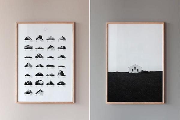
Some rugs are a true work of art. Rather than just using them on the floor they seem more appropriate to be used as wall hangings. Using a beautiful rug as wall art can do wonders for your home decor, as it will add texture and color variation to your space.
Since most rugs are made of natural materials, they tend to add a warm effect and provide the room with a cozy appearance. Just like ticker curtains and other fabrics, they tend to absorb sound and get rid of any echo in your space.
Since rugs are not often picked as wall decor, they tend to add a more unique character to your walls. They are an easy pick to make a statement. Whether you choose to go bold or subtle, hanging rugs will surely create a wow effect in your space. In the list below, you can find my favorite rug wall art ideas for you to get inspired by.
Hanging rugs to complement the interior color in your living room
The light grey wall color in this turn-of-the-century living room is paired with a modest color in the furnishings while an eye-catching wall rug hangs proudly on display. The olive green tone in the rug comes back in the fresh green plants spread throughout the room.
In the light grey living room below, a heavy-weight wool rug fills the wall space above the sofa and adds a cozy atmosphere to the room. The black lines in the rug pattern add a wonderful contrast to the setting.
The warm red tones in the wall hanging in this warm beige living room catch the eye once you step into this living room. Putting a long rug will accentuate the ceiling height and make the room height even more impressive.
Olive, grey, and beige tones in the wall rug stand out against a sage green living room wall color in a gorgeous historic living room. The rug fits within the boundaries of the wainscoting for an elegant effect.
Fill free space next to a doorway with a smaller rug to make it more special. Even though there is no need to fill every single wall space, adding a few art pieces will make your home look more finished and personal.
The small studio living room in the example below has simple white walls with the rug above the sofa as the only wall decor. This makes the rug art even more special and it becomes a true focal point in the space.
Rug wall hangings add an original touch to a dining room
The warm wood tones of the dining table and chairs in this kitchen dining area are complemented by the gorgeous rug art with brown, yellow, and orange tones.
Hang a graphic black and white rug to accentuate the contrasting materials in your interior. The cotton rug in the dining room below fills the empty wall space next to the black wall shelf and matches the black elements in the decor.
The assymetric rug art matches this gorgeous interior with off-white walls perfectly. The doorway and fireplace frame the art perfectly and the subtle black elements in the rug add a bit of contrast to the natural color palette.
Photographed by Ozolappa, styled by Lingsell for Historiska Hem
Match your rugs to the color palette of the space to achieve a comforting and balanced look. Both the floor rug and the wall hanging in this dining room are selected in a natural brown tone, matching the building materials of this beautiful arched room.
Adding a textural touch with rug wall hangings in a bedroom interior
The layering of the different fabrics on the bed, paired with the tick fabric headboard, the rug, and the patchwork curtains creates such a beautiful layering in this bedroom. The wall hanging adds warmth to the beige wall color and finishes the bedroom look off perfectly.
A unique and contemporary wall hanging adds a beautiful texture to a modern bedroom with concrete flooring and a natural color palette enhanced with rustic wood tones.
A polka dot rug on a wood bar decorates the space above a beige fabric headboard. The beige tones also come back in the textiles on the bed, the curtains, and the fabric pendant light.
Wall hangings are a great way to add a bit of personality to your home office spot. Other than adding a gorgeous pattern and texture, the rug will also absorb unwanted sounds from online meetings when you are working in a shared space.
Rug wall art to add a playful touch to a kid’s bedroom
In the example below, a kid’s bedroom is decorated with a heavy rug in the shape of a polar bear, adding a playful touch to a gorgeous bedroom setting.
A quilted blanket is hung up above the bed in a kid’s room. The pear print adds a graphic touch to the space, complementing the apple rattan basket next to the bed.
As one of the biggest names in Danish furniture design, Poul Kjærholm is celebrated for his uncompromising approach to form, materials, and craftsmanship: three elements that were instrumental in the Danish Modern movement.
Poul Kjærholm created the PK1 chair in 1955. The iconic design was his first chair design and paired brushed steel and wicker. After adding the PK1 chair to their collection in 2017, Carl Hansen & Søn reintroduced the PK1 chair in steel and FSC-certified paper cord, a natural and durable material that patinates beautifully over time.
Even though the paper cord is a new element introduced to the design, the newly launched chair looks exceptionally familiar and is a testament to the iconic furniture piece designed by the master furniture architect in the fifties.
Poul Kjærholm: one of the star architects behind Danish Modern
Poul Kjærholm was known for his functionalistic approach to furniture design, cultivating simplicity and lightness in his designs. His favorite material was steel, and he excelled at combining it with other organic materials.
Both his functionalistic approach and his talent for combining steel with other materials are reflected in the design of the PK1 dining chair. The clean and minimalistic lines of the steel frame are in perfect balance with the comfort and softness of the paper cord (or wicker in his initial design from 1955).
According to Knud Erik Hansen, third-generation owner-manager of Carl Hansen & Son the designer’s ability to combine functionality with aesthetics in a light and elegant way is what makes him a natural member of the design family of Carl Hansen & Son.
The design of the PK1 chair
The classic PK1 dining chair is comfortable, lightweight, and stackable, which makes it suitable for both private and public use. Its’ lightness and form make it a perfect addition to a range of different interior styles.
The PK1 chair is available in a stainless steel or black powder-coated steel frame, both paired with a beautiful paper cord seat. I was fortunate enough to be able to try out the stainless steel chair in my own home and I love how the combination of materials complements the minimal decor and modest color palette in my home.
The modern finish on the stainless steel contrasts with the beautiful and intricate weaving of the paper cord, resulting in a perfect balance between the two materials.
A switch in construction materials to ensure longevity
Carl Hansen & Son is known for incorporating paper cord in their production. In the PK1 chair, the paper cord complements the steel elegantly. It takes a skilled craftsman a full 15 hours and 180 meters of cord to hand weave the all-in-one seat and back on the PK1.
The intricate weaving technique is inspired by Kjærholm’s original work with wicker and looks just as beautiful from the front as from the back. Carl Hansen & Son has worked in close cooperation with the Kjærholm family to develop a weaving technique for the PK1 chair that brings together the best of both Poul Kjærholm and Carl Hansen & Son.
Other than an update in materials, the size of the original chair has been adjusted. The dimensions of the chair have been scaled up by 6% to match the size of people today, as people have increased in size significantly since the PK1 was launched in the mid-1950s.
This blog post was written in collaboration with Carl Hansen & Son, however, as always, my opinions are my own.
Posted inMy Home|Comments Off on Poul Kjærholm’s iconic PK1 chair from Carl Hansen & Søn with a paper cord seat
I love the subtle color balance achieved in this beautiful turn-of-the-century apartment in Sweden (Styled by Grey Deco, photographed by Fredrik J Karlsson for Alvhem). The spacious kitchen with a dining table in the middle of the room is connected to the living room with historic double interior doors and I love how you can look from one room into the other.
The kitchen features dark grey shaker cabinets that spread across the kitchen wall. The absence of upper cabinets gives the space a light and airy look despite the darker cabinet color. The brass hardware adds an elegant focal point to the shaker cabinets and the spacious dining table in the middle of the room is great for gathering with friends and family.
Both the living room and bedroom have a light grey wall color, which is paired with a natural color palette. The contrast of the blue sofa in the living room works wonderfully with the crisp white wainscoting on the wall.
Dark grey shaker cabinets and gold hardware for a contrasting look in the kitchen
The spacious kitchen has a row of lower modules without upper cabinets on one of the kitchen walls. Since the walls are painted white, this contrasting layout has a light and airy effect in the space.
The dark grey shaker cabinets are paired with brass hardware, a white marble countertop, and stainless steel appliances. The backsplash is treated with white tile that brightens the color palette.
A large wall shelf is applied right above the tile backsplash. This shelving is a perfect spot for adding the prettiest kitchen essentials on display.
The wall opposed to the window has a built-in pantry, followed by two large cupboards that include the fridge. The side of the large cupboard is finished with open shelving perfect for decor pieces or cookbooks.
The classic dining table and chairs are placed on top of a light grey area rug that adds a beautiful texture to the white-soaped hardwood flooring.
A vintage glass cabinet in a warm wood tone finishes off the kitchen design and adds a beautiful historic touch.
Through those beautiful white-painted historic double doors, you can catch a glimpse of the living room.
White wainscoting, light grey walls, and a blue couch in the living room
The light grey living room wall color is finished off with gorgeous white wainscoting that matches the white crown molding below the ceiling. This white and grey backdrop makes the dark blue fabric couch stand out in a lovely way. The cool tones also come back in the combination of art prints hung above the sofa.
A vintage glass cabinet is painted in a grey color that is just a few shades darker than the light grey tone on the walls, allowing it to pop out elegantly and subtly.
The blue couch is paired with a black marble coffee table and two vintage armchairs complete the look perfectly. The vintage sideboard next to the double interior door is finished with a round mirror.
The warm wood tone on the sideboard adds a warm element to the space and the green Monstera plant adds a fresh touch to the color palette.
The contrasting furniture pieces are complemented with a mix of neutral tones in the textiles and accessories, which gives the space a cozy appearance and a finished look.
Light grey bedroom walls and warm textiles
The light grey bedroom wall color adds a subtle contrast with the white ceiling and crown molding. The wall color also makes the white wardrobe stand out. The mixture of beige and brown textiles on the bed paired with the black wall lamp works well in the room.
The classic white wardrobe is built in a corner layout, allowing a lot of storage space on a relatively small surface.
A guest bedroom and home office combined
The guest bedroom has a bright white color palette finished with beige and brown tones on the bed. This color palette has similarities with the main bedroom.
Opposed to the bed, you can find wall shelving with an integrated bedroom home office, which is a great combination of functionalities.
An entryway with an asymmetrical floor plan
The entryway pairs a tile floor by the entry and white-soaped wood flooring in the rest of the space. The grey storage module with drawers turns into a seating bench for putting your shoes on.
A large wardrobe module fits perfectly in between two doorways and provides this space with extra storage opportunity.
Hexagon floor tiles and gold fixtures in the bathroom
The bathroom pairs a light grey hexagon floor tile with a simple white tile on the walls. The brass fixtures add a finishing touch to these different materials and apply a warm element to the space.