Material Moods by Pia Ulin

Good morning everyone ! I though it would be a good way to start the week with these pretty material compositions from Pia Ulin. They look so calm and balanced, a good way to start the Monday (to me at least).


Good morning everyone ! I though it would be a good way to start the week with these pretty material compositions from Pia Ulin. They look so calm and balanced, a good way to start the Monday (to me at least).

I saw this shelf from Torafu Architects and thought it was quit interesting. It’s another product with a secret hiding place (as you might have noticed in my previous posts, I tend to like that). The small wooden cylinders contain a magnet. If you place the magnets on the right place of the shelf, you can pull it and the drawer will open. I think this is a very cute design.


Claire-Anne O’Brien is a textile designer based in East London with a sculptural approach to textiles. She explores form, construction and scale through the unique properties of knitted fabrics. This results in these gorgeous knitted stools in different colors. It´s a very unique piece of furniture, which can give your home that extra pop.


Muted colors fit the winter season coming up and make everything look soft. The grey and black complements well with the muted color of the floor ad bring out the details added to this lovely apartment styled by Natasja Molenaar.


Another bright, white home for you today, to start the week. By keeping some of the traditional elements that where inside the home, and mixing them with some modern design and art, this house feels clean, yet cozy and effortless. I just feel a breeze of fresh air, just looking at those picture.


Pictures from here, found on House and Hold.
In the development of the Fiberglass DSR Chair by Charles Eames, more than fifty years ago, a carbon prototype of the chair was built. Till today, the prototype still stands because of it’s brilliant engineering. Bert Jan Pot designed the Carbon Chair in corporation with Marcel Wanders for Moooi, inspired by the carbon prototype Eames once created.
The pattern on the seat is very intriguing and reflects the strength pattern of the original DSR chair. Every point on the rim of the chair is connected with the four points connecting the seat to the base frame. But most of all, I think this chair is really pretty to look at.


Giving a character to a home, and making a house your home, means adding personal elements to it, showing who you are and what you´re passionate about. I have a feeling the owner of this apartment has something with Chemistry, as this was used as a theme to decorate. I really like it, it’s different and graphical. This and the pretty furniture aside, I’m a big fan of the bricks showing in the kitchen as well.


Pictures Alvhem
I would love to live on an apartment on the top floor, preferably as nice as this one here. It seems so nice to be able to look over the trees and have a lot of light beaming into the living room. The interior in this apartment has been kept quit simple, which brings out the architectural lines the attic apartment brings.


Pictures from Alvhem Makleri
I have always been bothered by the cardboard tissue boxes around the house. It’s always handy to have some tissues by hand, but it’s always so ugly inside the house, despite efforts of some brands trying to make the cardboard box more pleasing. This design, the paper pot, is the ideal solution for this problem. It’s elegant, it has a nice design and comes in different colors. You can either put tissues in it, or mount a toilet roll inside. I wouldn’t mind putting this baby next to my bed for the winter colds, that’s for sure.
Pictures from here


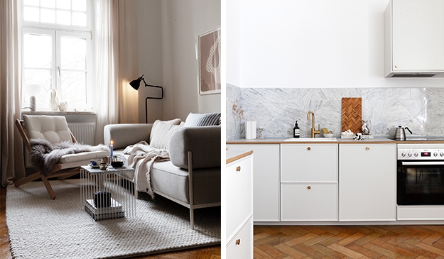
I read about this apartment on Cherry Blossom blog (really nice blog by the way, you should have a look if you don’t know about it yet), and I thought I should share it with you. I think there is a real romantic vibe going on in this apartment, not too much, just about the right amount. I like the colors and vintage items. Cherry Blossom Blog described the kitchen color as Acne-inspired, I think that’s so true. Even though it’s not a color I would pick for my kitchen, I think here it fits really well, it gives the room a warm and cozy feeling. The apartment itself is from 1930, with nice ceiling details and herringbone floors.
Picture from here.