I love the color palette of this beautiful bedroom with a subtle light grey tone on the wall. It’s a natural palette with some blue accents, which is quite simple, yet the contrast between the cool and warm tints works in such a powerful way. The bed is made with white sheets and a light beige blanket*, which is matched with the beige in the art print on the wall. The dark blue blanket and pillow on the bench by the end of the bed really stand out and the area rug by the end of the bed adds a nice texture in combination with the beautiful hardwood flooring.
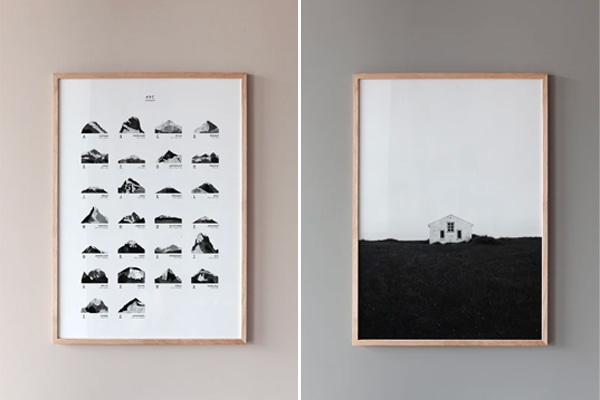
There is also space for a small home office spot in this bedroom. The beautiful vintage table is combined with a black chair with chrome legs and also here you can see tints of blue in the books and in the art prints.
I love this small studio home with olive green accents. This studio is planned in a very open way, with a doorway between the kitchen and the living area and a niche for the bedroom. I love the fact that the sleeping area is visually separated from the living room because of the dark olive green wall color of the niche only. The white bed linen, beige pillowcases, and beige crinkled blanket match the art prints on the wall and I love the little wall shelf that is used as a nightstand.
The sofa area has a beautiful mixture of beige textiles and prints as well and I love that there is space for a small dining table in front of the windows. When you peak into the small kitchen from the living room area, you can see a little curtain underneath the sink, which has the same tint as the wall of the sleeping area. It’s touches like these that make this home stylish and special I think.
I love the subtle shades of grey in this beautiful Swedish shaker kitchen. The soaped oak round dining table and chairs fit perfectly in this layout and it’s nice to have the dining area in front of the window as well. Apart from the fridge (and the exhaust of course), the kitchen is built out of lower cabinets only, keeping the look lighter. I love the custom-made open shelving in the same color as the cabinets, which is a perfect spot for the prettiest ceramics or for things that are used more often.
This kitchen also features a small walk-in pantry which is entirely painted in beige. I love that the shelves have the same color as the panels on the wall and wish I had a pantry like this in my home, as it reduces the need for more cabinets in the kitchen.
I love this small studio home and think even though it doesn’t have a lot of m2, it still looks spacious because of the carefully selected furniture and accessories, which still allow for a lot of empty space around each functional area. The living room combines a space for the sofa and a sleeping area. By placing the bed against the wall, the space is optimally used and the lamp and art print above the bed visually turn this into a separated area, away from the rest of the room. I think the peach-colored duvet cover* really stands out against all the natural colors in this space and I like the plants in the window, which add a natural touch to the interior.
Even though very simple, I also really like the small dining area in the kitchen. I love the contrast between the black dining table and the white chairs and just like at the bed, the lamp and print really ground the dining area in the space.
I love homes with a vintage touch and this living kitchen has a few that really stand out. The bottom of the kitchen is new, yet it has these beautiful angled upper cabinets, which are from a few decades ago. I love the mix with the clean lower cabinets in grey.
The vintage dining table and chairs work really nicely against the olive green wall and I love the shelving which has been placed close to the ceiling for plants. The shelf frames the green wall, which is a nice touch as well.
I have written about Italian brand GSI on the blog before and I’m a big fan of their ability to combine timeless and elegant design with technological innovation for a bathroom design that can stand the test of time in terms of quality and aesthetics.
The brand has recently presented its new Nubes collection, which will be available in October and can be characterized by rigor, lightness, and versatility. The Nubes collection consists out of a range of technologically and stylistically avant-garde products catered to be used in contemporary bathrooms. The Nubes washbasins can be installed on walls, stands, or shelves and are characterized by their minimal square shape and light look. A selection of the washbasins is available in the matt tones of the Color Elements (which I talked about in detail in this blogpost).
The collection is completed by two pairs of suspended wc/bidets and a floor standing pair of wc/bidet, both characterized by soft, sinuous lines, seen in the pictures below. The wc’s are equipped with the world’s quietest Swirlflush® flushing system (it has a noise level of just 64dB) which directs water evenly. The surface of each wc has the Extraglaze®Antibacterial ceramic finishing which is enriched with silver and titanium ions that provide ISO 22196 certified anti-bacterial protection. This renders surfaces extremely polished and smooth for immaculate and effortless hygiene. It prevents limescale deposits, leaves surfaces shinier, makes ordinary cleaning easier, and reduces bacteria counts by 99.99%. The design doesn’t have any hidden, hard-to-reach parts either, which makes it easier to clean and the anti-bacterial formula is even applied to the wc lids, which are made with FDA and EPA-approved resins that prevent the growth of germs and bacteria thanks to the properties of silver ions. The lids have a Quickrelease installation system which allows the cover to be removed by hand without tools and the slow closing SoftClose system that avoids accidental slamming.
These technologies add to the ease of use of the products and I think hygiene is such an important factor when selecting bathroom elements. If I think back at how much time I spent cleaning the bathroom over the years, I wish I would have had these technological advancements that improve hygiene and are easier to clean. In the pictures below you can see the Nubes collection integrated into beautiful, exemplary bathroom designs, which are minimal in aesthetic, letting the clean lines of the products and the materials in the space define the subtle look of the space. A bathroom like this can stay for years and it will still look good thanks to its timeless design and the technological advancements that are integrated so that the products can be kept clean and hygienic over time.
GSI products are produced in Gallese, Italy: a ceramic production region with a thousand-year tradition. Craftmanship is constantly enhanced by technology to not only create the best possible products but also to respect the safety of the personnel. The most advanced machines available in the ceramic sector are used in order to eliminate the riskiest manual tasks and ensure a healthy workspace. The production obtains its energy from renewable sources, recovers wastewater for reuse in the production cycle, and reduces the consumption of combustible gas by recovering the heath used in the processes.
Every GSI product is designed with aesthetics and technological innovation in mind for the best user experience and produced in Italy with the greatest craftsmanship, care for its personnel and the environment: all factors that make the brand stand out.
This post was written in collaboration with GSI Ceramica however all opinions are my own of course. If you would like get inspired for your bathroom project, have a look on their website.
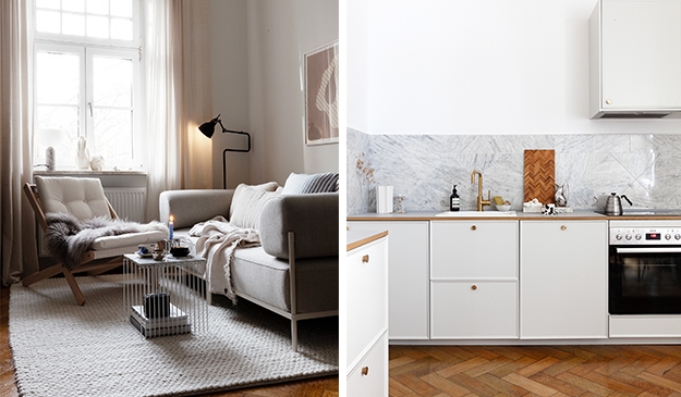
I think this home has such a beautiful mixture of materials. All the wood used on the floor, ceilings, and windows gives the space a really warm look, which has been complemented with an interior that has a lot of grey tints that contrast with and enhance the wood.
The living room has a dark grey sofa against a light grey wall which has been decorated with two canvas art pieces with light grey in them as well, giving everything on this wall a tone-on-tone look. The heating has been covered with wood, which is a nice touch, and the soaped oak armchairs and hemp area rug add a beautiful natural touch to this space.
The kitchen follows the palette of the living room with the dark grey cabinet fronts and the wooden dining table and chairs. In fact, the entire space has been decorated in the same palette and I love that this is a red thread throughout the space. I love the two-person workspace that has been fitted between two walls in the guest bedroom as well, such a nice way to use this space.
Danish Norm Architects and Japanese design brand Karimoku Case Study teamed up for their fourth exciting project, called the Azabu Residence made in collaboration with designer Keiji Ahsizawa. The fine wooden furniture pieces were created as part of this complete renovation projects in a luxury apartment built in 1988 in the quiet Nishi-Azabu residential district of Tokyo.
The Azabu apartment brings Japanese and Scandinavian design together. This project arose from the shared belief in the use of natural materials and a muted, dark toned color palette. This open but cozy apartment is characterized by its tactile, soft-minimal and timeless nature.
The Azabu project was inspired by a mid-century American and Brazilian modernism which translates into the use of warm dark natural materials and wooden wall paneling, lush carpets and tactile upholstery. I love that the apartment uses dark tones but still keeps a very cozy and welcoming feel to it.
Last year, Danish design brand Fredericia has visited Børge Mogensen’ former house just north of Copenhagen. Børge Mogensen has designed so many beautiful furniture pieces for the brand, so the brand decided to honor his immense talent and the role this house played in this life.
Mogensen designed the house together with architects Arne Karlsen and Erling Zeuthen Nilsen. Although, it appears that Mogensen did most of it single-handedly. Mogensen lived in the house, with his wife Alice, for 15 years and assembled it to fit most of his iconic designs.
Soon, the house got the nickname, “the laboratory”, as it became the place where Alice designed fashion and Mogensen experimented with prototypes for his furniture. The prototypes were always tested by the whole family and were to be found all over the house. Only when the kids were able to jump the couches and everyone could sit on the chairs would they be considered “approved”.
Mogensen, curious as he is, would often be contemplating about all kinds of improvements to his work. This kept him forever busy with trying to make the furniture and designs more flawless and complete. The house itself, but also the way Mogensen lived, was unpretentious. Just as Mogensen wanted us to live our own lives …
Swedish concept store Artilleriet has teamed up with Tre Sekel to design a kitchen that is meant to be a piece of furniture. A kitchen created for everyday use, without handles, where everything is uncovered.
Each of these kitchens is handmade by professional craftsmen locally in Sweden. This makes every kitchen special and unique. With its’ solid wood cabinet frames, drawers, and doors, this kitchen has a supreme quality and can stand the test of time. The woodwork is available in smoked or white soaped oak and all of the drawers have dovetail joints and the interiors are draped with Tärnsjö leather, which has a very beautiful look and feel.