Category Archives: My Home

Poul Kjærholm’s iconic PK1 chair from Carl Hansen & Søn with a paper cord seat

post

As one of the biggest names in Danish furniture design, Poul Kjærholm is celebrated for his uncompromising approach to form, materials, and craftsmanship: three elements that were instrumental in the Danish Modern movement.

Poul Kjærholm created the PK1 chair in 1955. The iconic design was his first chair design and paired brushed steel and wicker. After adding the PK1 chair to their collection in 2017, Carl Hansen & Søn reintroduced the PK1 chair in steel and FSC-certified paper cord, a natural and durable material that patinates beautifully over time.

Even though the paper cord is a new element introduced to the design, the newly launched chair looks exceptionally familiar and is a testament to the iconic furniture piece designed by the master furniture architect in the fifties.

Poul Kjærholm: one of the star architects behind Danish Modern

Poul Kjærholm was known for his functionalistic approach to furniture design, cultivating simplicity and lightness in his designs. His favorite material was steel, and he excelled at combining it with other organic materials.

Both his functionalistic approach and his talent for combining steel with other materials are reflected in the design of the PK1 dining chair. The clean and minimalistic lines of the steel frame are in perfect balance with the comfort and softness of the paper cord (or wicker in his initial design from 1955).

According to Knud Erik Hansen, third-generation owner-manager of Carl Hansen & Son the designer’s ability to combine functionality with aesthetics in a light and elegant way is what makes him a natural member of the design family of Carl Hansen & Son.

The design of the PK1 chair

The classic PK1 dining chair is comfortable, lightweight, and stackable, which makes it suitable for both private and public use. Its’ lightness and form make it a perfect addition to a range of different interior styles.

The PK1 chair is available in a stainless steel or black powder-coated steel frame, both paired with a beautiful paper cord seat. I was fortunate enough to be able to try out the stainless steel chair in my own home and I love how the combination of materials complements the minimal decor and modest color palette in my home.

The modern finish on the stainless steel contrasts with the beautiful and intricate weaving of the paper cord, resulting in a perfect balance between the two materials.

A switch in construction materials to ensure longevity

Carl Hansen & Son is known for incorporating paper cord in their production. In the PK1 chair, the paper cord complements the steel elegantly. It takes a skilled craftsman a full 15 hours and 180 meters of cord to hand weave the all-in-one seat and back on the PK1.

The intricate weaving technique is inspired by Kjærholm’s original work with wicker and looks just as beautiful from the front as from the back. Carl Hansen & Son has worked in close cooperation with the Kjærholm family to develop a weaving technique for the PK1 chair that brings together the best of both Poul Kjærholm and Carl Hansen & Son.

Other than an update in materials, the size of the original chair has been adjusted. The dimensions of the chair have been scaled up by 6% to match the size of people today, as people have increased in size significantly since the PK1 was launched in the mid-1950s.

This blog post was written in collaboration with Carl Hansen & Son, however, as always, my opinions are my own.

Posted in My Home | Comments Off on Poul Kjærholm’s iconic PK1 chair from Carl Hansen & Søn with a paper cord seat

VLA61 Monarch Chair from Carl Hansen & Søn

post

Originally designed in 1944 by Vilhelm Lauritzen, back in the day, the majestic VLA61 Monarch chair was produced only 10 times. As you can probably imagine, this made the chair a much-coveted piece for collectors and auction houses. In collaboration with Vilhelm Lauritzen Architects the iconic design piece is now made available by Carl Hansen & Søn to a wider audience for the very first time and I’m so happy I could try out this masterpiece in my own home.

The design of the chair is inspired by the majestic Monarch butterfly, a keen interest of Vilhelm Lauritzen himself, and the reason behind the chair’s name.

The design of the VLA61 Monarch chair

The VLA61 Monarch Chair has generous upholstery, a curved armrest, and teardrop-shaped bars with an organic appearance. The design embodies a light, artistic expression with a high-end appearance at the same time. The small brass feet and hand-polished joints finish the chair off perfectly and are a true testament to Lauritzen’s consistent design signature.

The double-curved armrests and the beautiful organic frame give the chair a clear expression with a supreme level of comfort that embraces you the moment you sit down.

I picked out the chair in a white upholstery fabric paired up with oiled oak, which pairs great with the historic hardwood floor and minimal white furniture pieces in my dining room.

Vilhelm Lauritzen: a pioneer of Danish modernism and a master of details

Vilhelm Lauritzen (1894-1984) was a leading Danish architect whose buildings are cultural monuments nowadays as a testament to his pioneering approach to functionalism. Often called the master of details, Lauritzen created the interiors for all of his buildings with the highest attention to detail including chairs, tables, chandeliers, fixtures and even sockets. He designed the Vega Chair, which I wrote about a few months ago for the Vega Concert Hall for example.

In 1944 he designed the Monarch VLA61 Monarch chair for a building project that was never realised, however, the chair was produced in 10 copies only. An extremely rare and sought-after design piece you can imagine, which is why it’s such great news that the piece is now available to a wider audience.

A form that complements function was an important factor in the design process of Vilhelm Lauritzen, which was driven by his functionalist approach. The VLA61 Monarch Chair is the perfect example of this approach with its double-curved armrests, the organic frame design, and the elegant brass feet that finish this design classic off. When you sit down in this comfortable chair, it feels like an embrace, which speaks to the designers’ emphasis on functionalism.

The handcrafted production process of the VLA61 Monarch Chair

Carl Hansen & Søn teamed up with Vilhelm Lauritzen Architects to re-introduce this carefully considered design piece with a modern perspective on material composition and details.

Hours of passionate craftsmanship go into the production of each chair. It’s a complex and time-consuming production process as many of the parts are curved and even double-curved. All parts are polished by hand several times before assembly, after which the entire piece is hand-polished again to ensure a perfect finish.

The backrest is upholstered after the chair is already assembled to ensure a perfect finish. It’s subtleties like these that contribute to highlighting the sculptural expression of the designers’ masterpiece.

A perfect addition to the Carl Hansen & Søn collection, available in multiple colorways

After the introduction of the Vega Chair and Foyer series, which has been received very well worldwide, Carl Hansen & Søn is pleased to work together with Vilhelm Lauritzen Architects again to introduce another of his masterpieces to a global audience.

The team worked with the designers’ initial sketches, detailed hand drawings, old pictures, and auction descriptions to get as close as possible to the original design while also giving the chair a modern expression with the materials. The VLA61 Monarch Chair comes in 9 variants, all of which pay tribute to this classic design piece.

This blog post was written in collaboration with Carl Hansen, however, all opinions are my own. You can read more about the VLA61 Monarch Chair here.

Posted in My Home | Comments Off on VLA61 Monarch Chair from Carl Hansen & Søn

CH004 Nesting tables: Hans Wegners’ design for flexible interiors

post

Nesting tables are such a versatile element for any interior, as you can easily re-arrange them to your needs. I live in a relatively small city apartment, which makes me on the lookout for the best space-saving storage solutions, or flexible furniture pieces to possibly optimize my interior and make the most out of a small surface.

My living room is quite narrow, which makes it a challenge to fit a large coffee table and I find myself switching around a lounge chair or a pouf depending on whether I have guests over or am getting ready for an evening watching my favorite series.

I recently got to try out the CH004 nesting tables designed by Hans J. Wegner in 1952, which offer a flexible combination of coffee and side tables, which can be used in any interior and I love the way you can combine them together or use them individually depending on your needs.

The CH004 nesting tables in soaped oak designed by Hans J. Wegner in 1952 for Carl Hansen & Søn

CH004 nesting tables produced by Carl Hansen & Søn

The CH004 nesting tables have a recognizable, classic Wegner minimalism ranging from the round, tapered legs, and classic mortise joints to the subtle curves for an organic and timeless appearance. Since the tables are so light and space-optimized, they are perfect for any interior.

The three different-size tables fit into each other smoothly and you can arrange them in many different ways. When I have guests over, I like to use two or three and make a little styling arrangement on them. When I use a pouf when watching TV, however, I like to just have one of them as a small coffee table and use the other two as a side table for a lamp.

Wegner’s Nesting tables have an air of lightness about them that makes it easy to reorganize them and create smaller zones within a room. For someone that likes to style and re-style so often, these are such a great solution.

Designed in 1952, the CH004 nesting tables are still relevant today

With the increased need for flexible interior solutions in the 1950s, nesting tables became popular and were in high demand. Hans J. Wegners’ designs can be recognized for their simplicity and functionality and his design of the nesting tables is no exception. Just like the rest of his design legacy, the nesting tables enhance any room through their harmonious and aesthetic dimensions and materials.

Today, the need for flexible and adaptable furniture solutions is more relevant than ever, making Wegners’ timeless nesting tables a perfect design classic for modern interiors.

Hans Wegner’s design legacy

Hans Wegner, the designer of the iconic Wishbone chair which has been in continuous production ever since it was brought to life in 1950, is considered one the most creative, innovative, and prolific Danish furniture designers. Wegner has created more than 500 chairs over his lifetime for which he earned the name ‘master of the chair’.

The Wehner legacy shows the inner soul of furniture pieces through a simple and functional interior, which is a recognizable element on the beautiful nesting tables as well.

Different material variations of the CH004 nesting tables

I picked out the nesting tables in soaped oak, which have a very light appearance and I love the way they stand out against the warm tones of the herringbone flooring in my apartment. The iconic design is available in natural oak (which Abi featured in her home), walnut, or an oak and walnut mix as well, which makes them truly adaptable to any interior.

*This blog post was written in collaboration with Carl Hansen & Son, however as always, my opinions are my own.

Posted in Design, My Home | Comments Off on CH004 Nesting tables: Hans Wegners’ design for flexible interiors

CH24 wishbone chair reintroduced in teak

post

Most of you probably know or have seen the CH24 wishbone chair designed by Hans Wegner for Carl Hansen & Son. Over the years, the wishbone chair, sometimes called y-chair has become a true icon of modern Danish design, and Hans Wegner is considered one of the most creative, innovative, and prolific Danish furniture designers.

Recently Carl Hansen & Son introduced the iconic dining chair in teak and I had the opportunity of trying out the new CH24 wishbone chairs in my own home.

The wishbone dining chair designed by Hans Wegner

Hans Wegner designed the first model of the Wishbone chair exclusively for Carl Hansen & Son in 1949 and the dining chair has been in continuous production ever since. With its unique form that combines the back-and armrest into a single piece, stability is given to the steam-bent top, while allowing for comfortable support.

The characteristic Y-shaped back that the wishbone chairs are named after is combined with elegant, tapered legs and a paper cord seat that can be complemented with a seat cushion.

The manufacturing requires more than 100 steps and the hand-woven seat alone with its’ 120 meters long paper cord and natural finish takes a skilled craftsman about an hour to create.

The solid wood Wishbone chair offers comfort and stability, combined with a distinct, elegant form and a modern design that has gained recognition as the ideal chair over the years.

A solid wood frame in teak and paper cord

I have tried out the CH24 wishbone chair in a lacquered version before, but the way the teak wood accentuates the curved backrest and complements the woven seat made out of a natural paper cord is so much more apparent in the teak version.

The teak wood frame adds warmth to the classic design of the Wishbone chair which is balanced out by the neutral tone of the durable paper cord seat. The vibrant color of the teak has noticeable color variations in the natural black grains of the solid wood, making this version of the Wishbone chair so characterful and elegant.

I have used the teak wishbone chair in both my office and as a dining chair and I love the way the design complements the original herringbone hardwood flooring in my apartment while standing out against the white color palette I have in my interior.

Teak wood was used in CH24 wishbone chairs from the 1950s-1960s

The first Wishbone chairs produces in the 1950s-1960s were made out of teak wood, which gave them their much-loved intense color. As the popularity of Wegner’s design grew, the use of tropical teak wood was replaced by Nordic wood types like oak and beech.

In the past 70 years, however, teak forestry has changed dramatically and it’s now possible to source teak wood from responsibly managed forests. This makes it possible to responsibly produce the wishbone chair in its original solid wood frame again like Hans Wegner first imagined.

Teak wood is very strong and stable and has a vibrant color that elegantly changes during its lifetime from orange to a reddish-brown hue. The black grain of the wood results in a dynamic expression that stays beautiful due to its natural content of oil.

CH327 table in teak with oak details

Along with the release of the wishbone chairs in teak, Carl Hansen reintroduced the CH327 dining table in teak wood as well, which allows you to complete your dining room setting. Also designed by Hans Weger, the CH327 dining table has a table top that appears to float above a refined frame featuring impeccable carvings and joints.

The dining table is now introduced in teak with oak details and a design aesthetic that complements wonderfully with the wishbone chair.

*This blog post was written in collaboration with Carl Hansen & Son, however as always, my opinions are my own.

Posted in My Home | Comments Off on CH24 wishbone chair reintroduced in teak

Tried and tested: A review of the Moccamaster KBG Select coffee maker

post

After thinking about it for the longest time, I finally took the plunge and decided to invest in the Moccamaster KBG Select coffee maker. Filter coffee has always been my preferred brewing process and I had been making manual drip coffee for years, so I knew I wanted to invest in a drip coffee maker rather than an espresso machine.

For me personally, aesthetics are very important, especially for electronics that you leave out on the counter, so to sum things up, I’m really happy with the Moccamaster coffee maker and would gladly pay a little more to have a machine that makes a great cup of coffee and is a looker at the same time.

Moccamaster KBG Select in matt black

Moccamaster KBG Select in matt black

Manual vs automatic drip coffee makers

The reason I took so long to finally buy the Moccamaster (or any other drip coffee machine for that matter) was because of the countertop space I undoubtedly had to give up in exchange for the ease of having a fresh cup of coffee with the push of a button.

While I had been refining my manual pour-over coffee techniques the best I could and even loved taking time over the weekends to heat the water to the perfect temperature and slowly sprinkle the water over the coffee grounds to achieve the perfect coffee bloom, during weekdays things just have to go quick sometimes and I would dread having to take the time.

While the Moccamaster is still relatively small in size compared to other coffee makers, it does take up considerable space on my countertop, there is no way around it. But it’s counter space I gladly gave up to have freshly brewed coffee in an instant in the morning.

An aesthetically pleasing retro design

One of the reasons the Moccamaster KBG had caught my eye is because of its beautiful retro design, available in a wide range of colors. Being a fan of a rather minimal and toned-down interior I went for the matt black version, which looks both elegant and high-end. Since the plastic components on the coffee maker are always black (also in the color and white versions), I think the black or matt black version has the most elegant and balanced look.

Moccamaster KBG Select in matt black

Built quality of the Moccamaster coffee machines

While the matt black on the base of the drip coffee maker looks super nice and enhances the retro design of the Moccamaster, I was initially a bit disappointed with the many plastic components: the water tank, brew basket, and lids are made of black plastic. It also makes them easy to clean and lightweight though so I’m not currently bothered by it and would buy the product again after knowing this. I also read that the plastics used are food-safe and BPA, BPS, BPF, and phthalate-free, so that’s great.

The Moccaster came delivered with one rubber foot shorter than the others, which I fixed with a felt sticker (you can even see it in some of the pictures). I’m sure I could have sent the coffee brewer back and gotten it replaced, but I didn’t consider it necessary for something I could easily fix myself.

Quality of the coffee made by the Moccamaster

I feel a bit reluctant to give a review here, as I am far from a coffee connoisseur. However, I can share a comparison of the quality of the coffee with my hand-pour-over set and with the Moccamaster coffee machine.

The quality of the coffee made with the Moccamaster is as good as the best coffee quality I was able to achieve by hand, which is exactly what I was looking for and with so much less hassle. Coffee quality depends highly on the quality of the beans you buy of course and I freshly grind my coffee beans before I brew the coffee, which in my opinion makes a huge difference.

If you don’t want to take my word for it though, the Moccamaster is certified by the specialty coffee association and the European Coffee Brewing Center after extensive quality control.

Moccamaster KBG Select in matt black

Moccamaster KBG Select in matt black

Subtle functionalities I appreciate about the Moccamaster coffee brewers

Other than turning fresh ground coffee beans into delicious filter coffee, which is the obvious functionality you would expect from the machine, there are some more subtle benefits I really appreciate about the machine.

A setting for a full or half a pot of coffee

During the week I drink coffee alone, and even though I think I drink quite a bit of coffee, I still only need half of the glass carafe. When I’m having people over though I easily need a full pot. The Moccamaster KBG Select has a smart button that you can set depending on how much coffee you need and both of the settings ensure the best quality coffee.

The hot plate switches off after 40min

While I like the fact that I can keep my coffee warm when needed, I don’t want the heating element to just consume energy when it’s not necessary (i.e. when I forget to turn it off), all while still enjoying my coffee hot. The KGB Select automatically turns off after 40 minutes, so you don’t have to worry about that.

If you want to keep your coffee hot for longer, you can always go for the Moccamaster KBGT, which has a stainless steel thermal carafe.

A great drip-stop

Compared to many coffee makers I have used in the past, the KGB Select has a great drip stop so that you don’t have to worry about taking out the carafe too early. While I don’t take it out while the machine is still actively brewing, it’s safe to pour a cup when there is still some water in the brew basket.

Conclusion

To me, the Moccamaster is the perfect coffee machine for the design conscious as the elegant retro design looks great on your kitchen counter. Compared to many standard drip coffee makers this easily is the most stylish one, available with a glass or thermal carafe.

While I’m not a coffee connoisseur I have tried to perfect my manual filter coffee over the past years and even though I was able to brew good coffee like this, the Moccamaster consistently makes high-quality coffee without having to put in the work. While I was a bit reluctant during the unboxing, after using the machine for a while, I can now confidently say that I would make the exact same purchase again.

Posted in Design, My Home, Shopping | Comments Off on Tried and tested: A review of the Moccamaster KBG Select coffee maker

Tried and tested: The Boogie chair by Karup design

post

Probably most known for its collection of Futon beds, Karup design creates Scandinavian furniture inspired by multifunctionality. The brand was founded in Denmark and has a beautiful collection space saving furniture solutions that shine in their design simplicity.

Boogie chair designed by Says Who

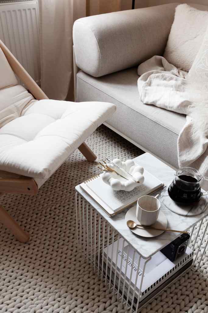
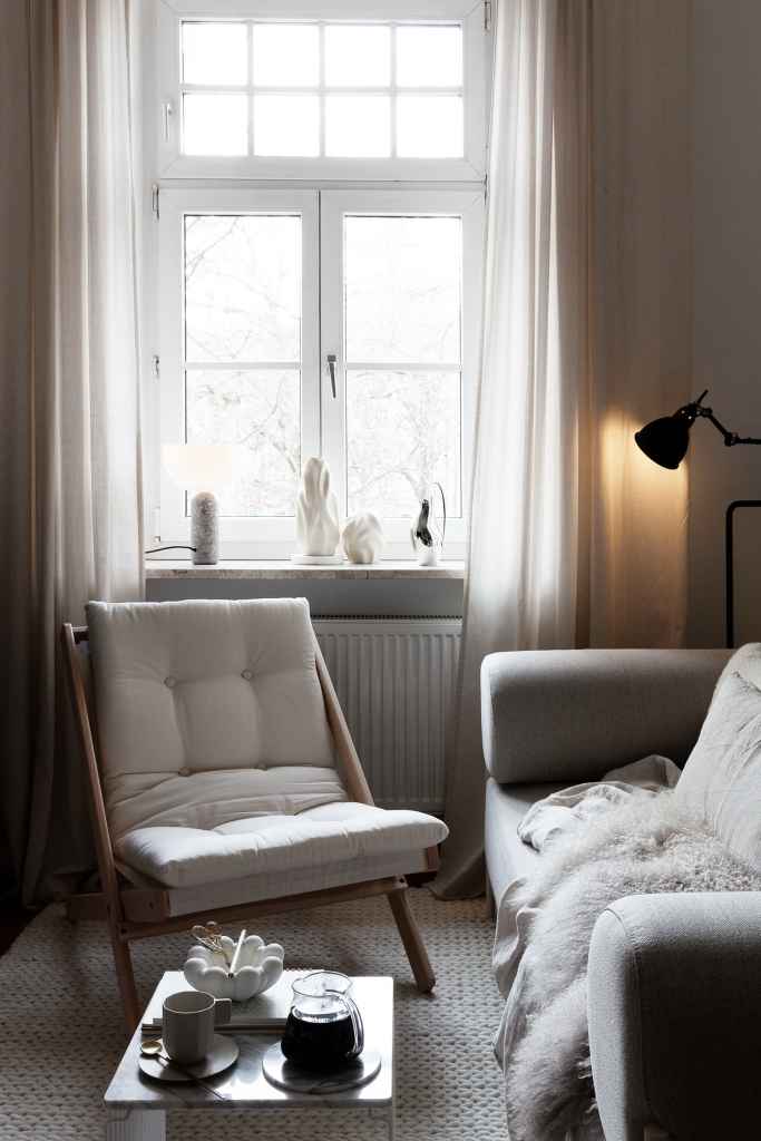
I recently had the opportunity to try out the Boogie chair in my home and I think it fits perfectly in my living room. I have a light color palette with a white rug and a light beige sofa (you can find a review about the Noah sofa here), so I picked out the Boogie chair in Raw beech combined with a natural color mattress to match the space.

The classic sling design fits well in a Scandinavian interior, can be folded to store away and I think it’s so comfortable as well: perfect for reading a book.

An affordable lounger

The comfort this chair provides is much better than many lounge chairs I have tried out, which makes it such an attractively priced option for a comfortable lounge chair even if you plan to keep it in place permanently.

Boogie for outdoor use

The Boogie chair can even be used outdoors and while I love mine as a lounge spot in my living room, the striped version makes a really nice outdoor lounge as well.

Posted in My Home | Comments Off on Tried and tested: The Boogie chair by Karup design

Christmas table setting with Arket

post

Christmas is getting closer and since I will be hosting one Christmas lunch here at my apartment, I decided to try out the holiday table decor and check out how I will be arranging everything. I’m really not a fan of an elaborate Christmas dinner table, yet I do love to add some Christmas touches to the table and its surroundings.

My go-to shop for Christmas decorations is Arket, they have the most subtle and beautiful decor for the modern home and holiday season and I decided to set the Christmas table with a selection of their amazing products kindly gifted to me to try out.

A subtle Christmas table setting

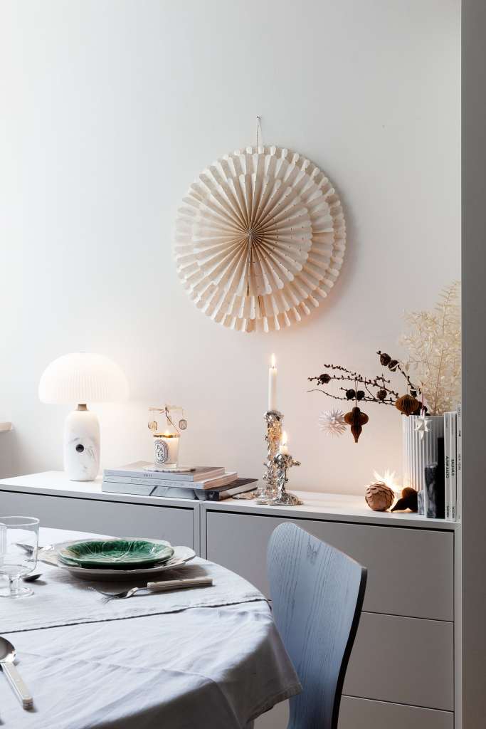
For my Christmas table, I didn’t want to overload things too much, so I worked with beautiful cabbage plates from Bordallo Pinheiro (€17 for the big plate*, €13 for the small plate*) which come in both a white and a green version. When it comes to holiday table decorating I love tints of green, for Christmas, so these plates are perfect. I love the combination of the white and green in the dinner plates and dessert plates, I think it adds a playful touch to the holiday table that puts the entire dining room in a festive mood.

I paired up the plates with the Ripple glasses from Ferm Living, and a white linen tablecloth from H&M home (€49,99 in a variety of colors*) which I have since forever, such great value for the price. To add some more texture to the textiles, I also added a table runner in grey, this one is from Himla. The bistro cutlery (€39 for a set of 4*) from Sabre Paris makes this table setting a bit more informal, which I like very much.

Christmas table decorations

To decorate the table, I spread out some paper decorations on a branch and in a bowl on the table, such an easy way to add an instant Christmas touch to your dining room table. The ones you see in the pictures are from Arket, but they are from previous years.

Every holiday season they bring out new color variations and you can usually buy 4 for 3* during the last months of the year. Their color palettes, though different every season, are always timeless, so I end up reusing them every year both for the Christmas table and to add some elegant Christmas touches throughout my interior.

The stars of the dining table to me are these organic candle holders made out of solid recycled brass with a silver coat on top (€59 per piece*). I love the way the organic silver shapes stand out against the other materials on the table and add a festive and glamorous touch.

A holiday table and its surroundings

Apart from the Christmas table setting, my dining room got a Christmas upgrade as well. I have used three paper stars to make the holiday table a bit more magical. The Snöblomma star from Watt & Veke (€ 65 a piece*) is fitted with a light bulb that is programmed to go on when it starts to get dark.

I have used a Wiz smart light for this, have a look at this blogpost if you want to know more about these programmable light bulbs. I have hung this one up in the window so it’s festive from inside and for the neighbors as well.

On the wall above the Christmas table, you can see the Leah paper star from Watt & Veke (€69 a piece*) which is a bit more graphic so I have used it without a lamp. On the wall above the cupboard, I have used an Afroart paper star combined with the Baies candle with a carousel* on top which turns around with the heat of the candle and spreads the most magical scent in the dining room.

The Drip candle Holders (€ 59 for the small version*, €99 for the medium version*) designed by Pascal Smelik for Pols Potten and the table lamp on my sideboard cast a lovely cozy light on the Christmas table setting, which what I think it’s all about when decorating for Christmas. I can’t wait to have people over and show them my subtle yet cozy and inviting Christmas table with a modern touch.

Other Christmas table settings to get inspired by

Looking for more Christmas table-setting ideas? I myself am a fan of a lighter color palette when it comes to Christmas table settings, but I find this darker mood so inspiring as well. Note that they used an oversized version of the Drip candle holders here, which is so impressive in this table setting.

Have a look here for a simple and minimal table setting with brass candlesticks and ornaments and branches as napkin rings. Lastly, while I wouldn’t have Christmas eve dinner exactly this messy, this Christmas tablescape has an impressive branch with gold ornaments that really attract the eye.

Posted in My Home | Comments Off on Christmas table setting with Arket

Vega Chair by Vilhelm Lauritzen for Carl Hansen & Søn

post

As a celebration of the 100th anniversary of Vilhelm Lauritzen architects, Carl Hansen & Søn is now releasing a selection of unique furniture pieces by the master architect that used to be produced solely for their intended use in the Radiohuset broadcasting building and the Vega concert hall in Denmark.

Vilhelm lauritzen architects: a pioneer of Danish functionalism

Vilhelm Lauritzen is a master architect with quite a legacy. He’s most famous for his Radiohuset, which he designed in 1945, and the complete design, inside and out, is now heritage-listed. Next to Radiohuset, he’s known for the Vega concert hall (1956).

The architect produced every single detail in his buildings, from the door knobs to the mirrors, and light fittings, to the furniture, the sofas in the foyer, and even the modern design typology used in the interior. This uncompromising commitment to the functionalism of his projects produced modern design pieces that are still so relevant today.

Carl Hansen brings two exclusive designs to private homes

Thanks to today’s collaboration with Carl Hansen and Søn, we now have access to two core ideas he exclusively developed for these two renowned buildings at the time: the Foyer series and the VLA26 Vega chair, which are now available for private homes as a tribute to the legendary architect and his contribution to Danish furniture design.

VLA26 Vega Chair: a modernist masterpiece now in production at Carl Hansen & Søn

The Vega chair was originally designed for Vega and up until recently could only be found in its’ historic concert halls. The chairs are stackable and produced with absolute craftsmanship out of steel and wood, finished off with precise upholstery in textile or leather that gives the chair a slender and refined look.

VLA26 is a modernist masterpiece and Vilhelm Lauritzen’s signature aesthetic can be found in the effortless and simple design so typical of designs from Denmark during the last century: functional pieces with ample character.

The design of the Vega stackable chairs

The ergonomics of the chair are well thought through as the back curves to embrace you. The design is available with upholstery for extra comfort or without upholstery, which puts even more focus on the finest craftsmanship of the curved oak and steel.

Finally, the masterpiece, deeply influenced by the functionality and aesthetics of the Vega concert hall, is finished off with wooden feet that lend an artisanal feel to the timeless design chair. This is my personal favorite element on this masterpiece, as it gives it a unique look and feel.

While the Vega chair fits the impressive concert halls that are covered with warm wood elements and graphic tiles perfectly, it certainly has a place in a modern-day interior as well. I tried out the chairs in my neutral-colored interior and I love the way the carefully crafted oak in the seat, back, and feet adds a soft tone to my warm wooden flooring and the way the black steel frame adds these fine and elegant contrasting lines to the setting.

Carl Hansen & Søn: iconic craftsmanship

Vilhelm Lauritzen is one of many mid-century Danish masters to join the Carl Hansen & Søn collection next to names like Hans J. Wegner, Ole Wanscher, Frits Henningsen, Arne Jacobsen, Kaare Klint, and Poul Kjærholm.

Probably best known for the CH24 wishbone chair designed by Hans Wegner, Carl Hansen and Søn’s bring to life iconic design pieces through the finest craftsmanship and with the highest quality materials. They always work closely together with the families and studios of the exceptional designers, nourishing a long-term relationship to ensure absolute adherence to their visions.

Through the work of these design icons, Carl Hansen & Søn is able to continually reinvent itself and through each of the chairs, tables, stools or even outdoor furniture is keeping Danish design heritage alive with one goal in mind: to gather the best, most iconic modern furniture designs under one roof.

This blog post was written in collaboration with Carl Hansen, however, all opinions are my own. You can read about the Windsor chair in my previous article here, or about the limited edition wishbone chair in collaboration with Ilse Crawford in this article.

Posted in Design, My Home | Comments Off on Vega Chair by Vilhelm Lauritzen for Carl Hansen & Søn

Diptyque Baies limited-edition candle with a carousel

post

Every year, the Parisian house Diptyque brings out a limited-edition candle with a cute carousel on top, which moves around because of the heat of the candle flame. The Diptyque carousel is part of a special collection released before Christmas and it has a different design every year.

The design of the carousel varies each year, yet the general concept stays the same. Delicate gold or silver elements rotate around the candle flame and turn around due to the heat of the candle.

This seasonal collector’s item is the perfect piece to celebrate the start of the winter season and becomes available at the end of the year. The light of the candle casts a beautiful reflection throughout your interior, like true magic.

Diptyque candle carousel 2023: an ode to the flame

The 2024 carousel features ten pendants that revolve around the candle and place the iconic Diptyque oval at the center. The calligram inspired by the poetic definition of the flame in the encyclopédie des lumières is the central motif of the 2024 holiday collection.

Where can you buy still the 2024 edition?

If you love the current edition, you better buy the carousel rather quickly, even though let’s be honest the product is not cheaply priced. I personally only bought the 2023 edition since I loved its form so much and then plan to use it in the following years as well.

You can still find the 2024 Carousel edition here*

Diptyque Carousel 2022: planets around the sun

The 2023 Diptyque carousel set has golden charms with the Diptyque’s recognizable ovals. The delicate golden patterns bounce around the flame and cast a lovely sparkle on surrounding surfaces. The ovals move like planets around the sun, which is also the theme of the limited edition gift box that is decorated with stars, dancing letters, and cosmic sparkle.

Diptyque Baies limited-edition candle with a carousel

Diptyque Baies limited-edition candle with a carousel

Where can you still buy the 2023 edition?

You have to be quick to order your carousel in time, but you might still be able to find the older designs on second-hand platforms in your location.

Diptyque Baies limited-edition candle with a carousel

Diptyque Baies limited-edition candle with a carousel

Maison Diptyque and the importance of typography

The logo and branding heritage of Diptyque is so recognizable and a big part of their brand strategy. The name in the logo is written like the structure of an ancient temple and the disorderly lettering is a twist on the traditional but with a whimsical touch.

You can immediately recognize the logo and their brand identity is one of the most iconic and elaborate I know. So much effort goes into designing the packaging and the Christmas edition products have extra special packaging.

Posted in My Home | 2 Comments

Beautiful autumn accessories from Arket

post

Autumn is in full swing, and I think you can start to notice the days are getting much shorter.  Once this happens, I always try to make up for it with lots of candles lights and warm tones in my interior. This never fails to put me into a warm and cozy autumn mood.

I combined my newest artwork ‘Caramel Tides’ with some new accessories from the Arket collection. I like their new vases* and candle holders*, which are such elegant pieces to add a touch of autumn in your home. On the table, you can find a combination of the Artichoke plates from Bordallo Pinheiro*, which add a playful touch to the table, while also being so stylish and elegant to look at.

In summer, I also made a table setting with the exquisite Bordallo Pinheiro plates, but there I used the flower version. I love how the plates in themselves create enough of a design element on the table, and they don’t need much else as they are so beautiful on their own.

Posted in My Home | Comments Off on Beautiful autumn accessories from Arket